Feature Purpose:
This feature allows organisers to add and customize exhibitor blocks in the Website Builder, enhancing the presentation and interaction with exhibitor content on their website.
Working with this Feature:
Adding Dynamic Content Blocks:
-
Accessing the Blocks:
-
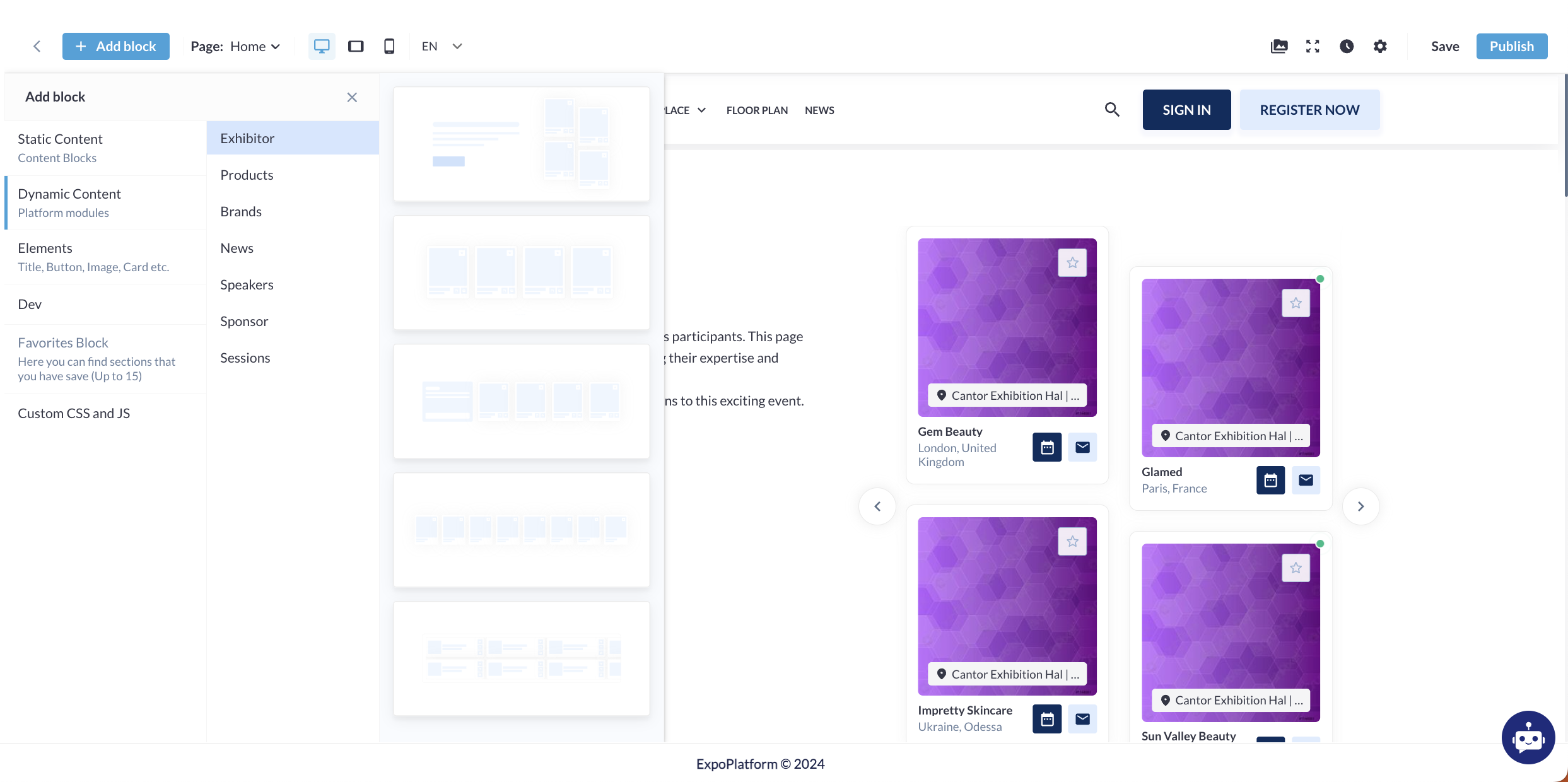
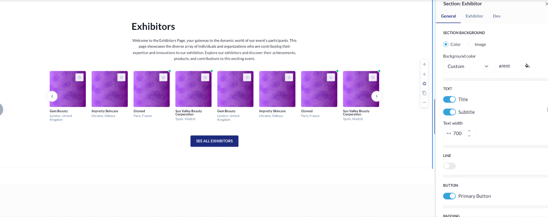
Navigate to the "Add Block" button>>Dynamic Content section and choose “Exhibitor”
-
Under the Exhibitor subsection, five different blocks are available for selection.
-
Blocks can be added by either dragging them into the builder or clicking on the "Add this block" pop-up function.
-
Types of Exhibitor Blocks:
-
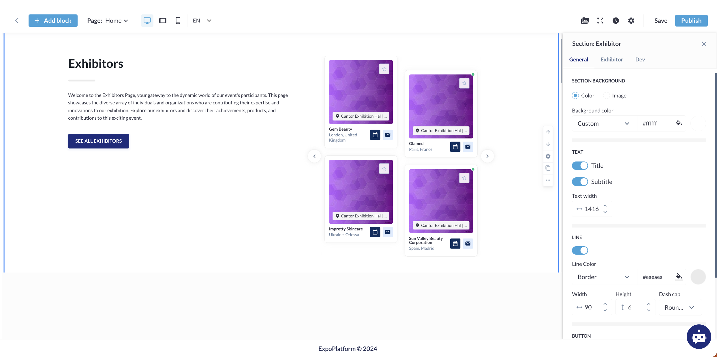
First Block:
-
Contains four Exhibitor cards.
-
Includes action buttons, primary text, secondary text, Exhibitor details, and a "See All Exhibitors" button.
-
Offers a list of customizable settings.
-
-
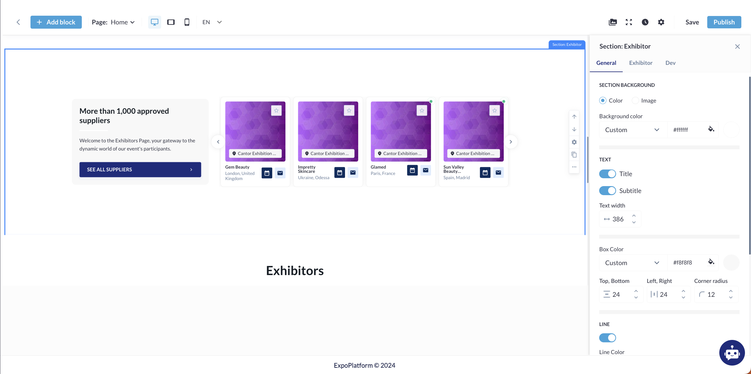
Second Block:
-
Similar to the first block, it consists of four Exhibitor cards with the same features and customizable settings but the block layout is different.
-
-
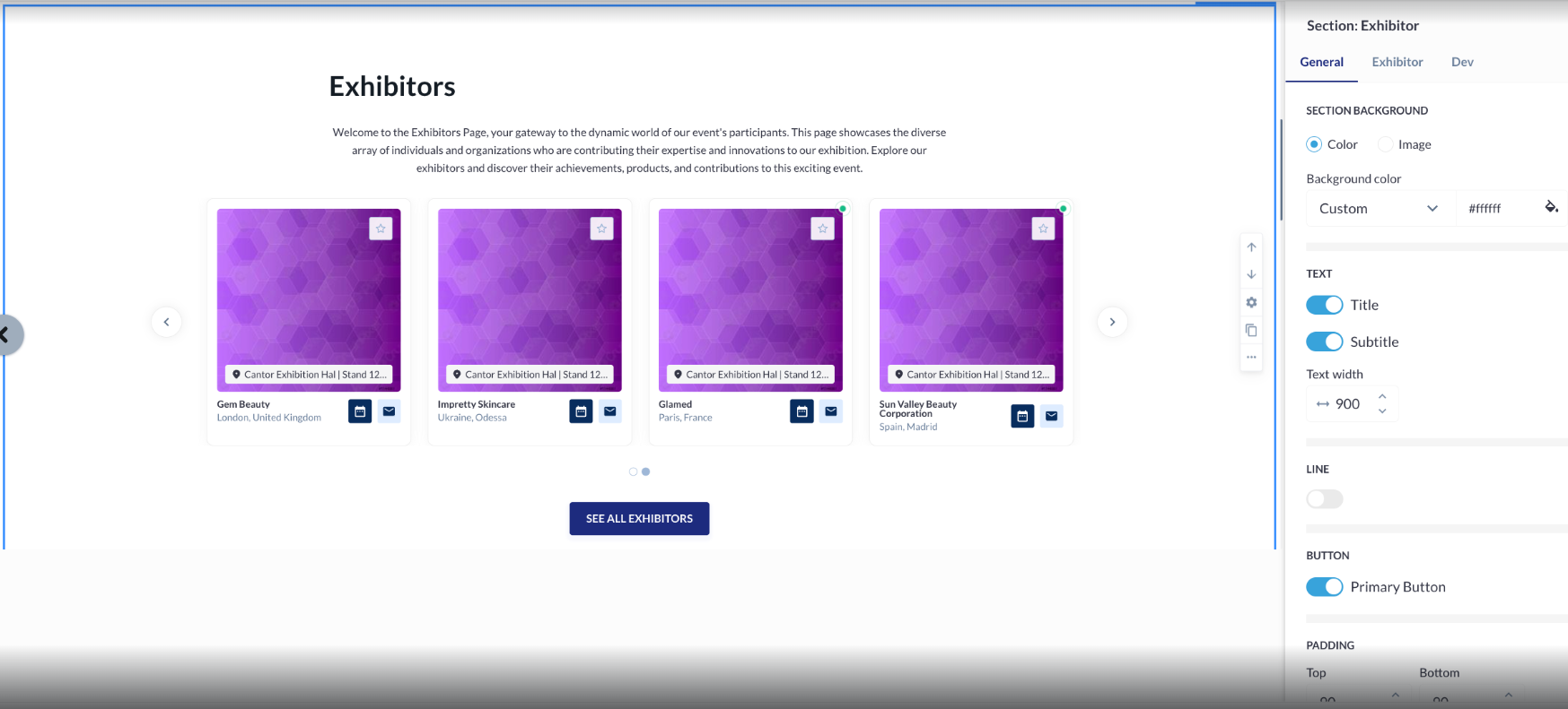
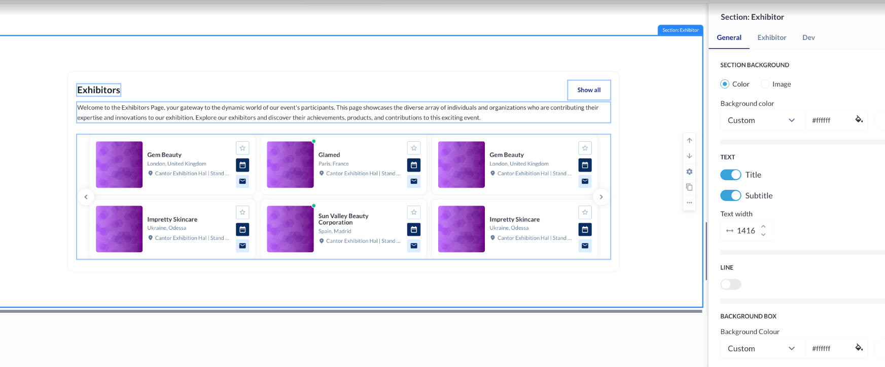
Third Block:
-
This block also includes four Exhibitor cards with action buttons, primary text, secondary text, Exhibitor details, and a "See All Exhibitors" button, but the layout is different.
-
Provides a list of customization settings.
-
-
Fourth Block:
-
Features eight Exhibitor cards with action buttons, primary text, secondary text, Exhibitor details, and a "See All Exhibitors" button.
-
Comes with a list of customizable settings.
-
-
Fifth Block:
-
Comprises six Exhibitor cards with action buttons, primary text, secondary text, Exhibitor details, and a "Show All" button.
-
Includes a list of customization settings.
-
Customization Options for Each Block:
-
Interval Between Block Elements:
-
Adjust the interval manually by stretching or entering a distance ranging from 1 to 200.
-
-
Typography Settings:
-
Customize text colour and style.
-
Available settings in the "Show Font Setting" tab:
-
Font name, weight, and size
-
Alignment
-
Case
-
Decoration
-
-
-
Button Settings:
-
Configure the appearance and behaviour of action buttons.
-
-
Button Link Settings:
-
Define the links for the buttons.
-
-
Sessions Settings in the Block:
-
Customize the display of session information.
-
-
Dev Settings in the Block:
-
Input custom CSS styles using the Data-styleid.
-
-
Anchor Settings:
-
Assign an ID to the block that can be used in links to scroll directly to the block.
-
Block Management Options:
-
Move the Block:
-
Move the block up or down by one position.
-
-
Duplicate the Block:
-
Create an identical copy of the block.
-
-
More Actions:
-
Add the block to the Favorite section.
-
Deactivate the block.
-
Delete the block.
-
Troubleshooting:
-
Adding Blocks:
-
Ensure you are in the correct section (Dynamic Content → Exhibitor) to access the blocks.
-
Verify that the blocks are properly dragged or clicked to be added to the builder.
-
-
Customization Settings:
-
Double-check that all typography, buttons, and interval settings are entered correctly.
-
Verify CSS entries under Dev settings for proper styling.
-
-
Block Management:
-
Ensure the correct block is selected before moving, duplicating, or performing other actions.
-
Check for any deactivation that might be affecting block visibility.
-