Feature Purpose:
The Website Preview feature allows administrators to simulate how their event website will appear on different screen sizes. This is crucial for ensuring responsive design, usability, and visual consistency before the website goes live.
By offering device-specific previews Mobile, Tablet, and Desktop it enables admins/organizers to:
-
Validate layout adaptability
-
Detect and correct UI/UX inconsistencies
-
Preview how text, images, buttons, and banners are displayed
-
Ensure key CTAs and navigation elements are easily accessible on each device
This function is especially useful when launching websites that must accommodate a global audience using a variety of devices.
Working with this Feature:
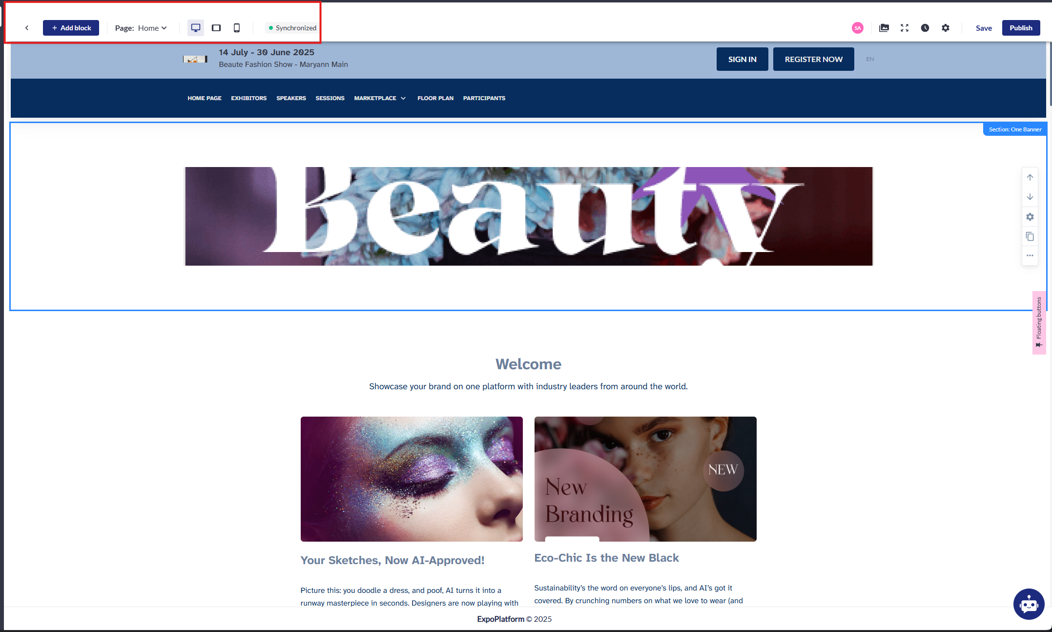
Accessing Website Preview
-
Log in to ExpoPlatform Admin Panel
-
Navigate to Website Builder under the event’s configuration.
-
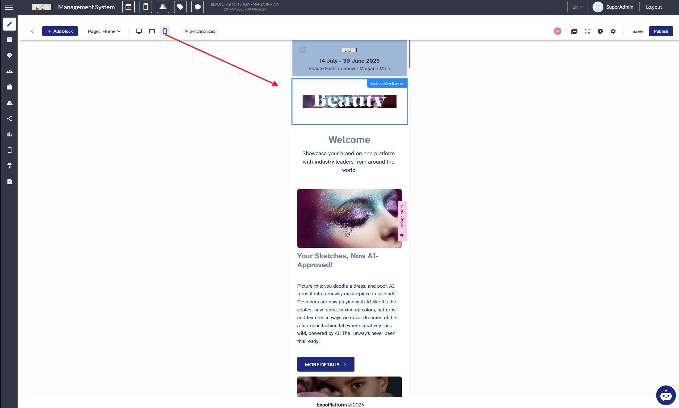
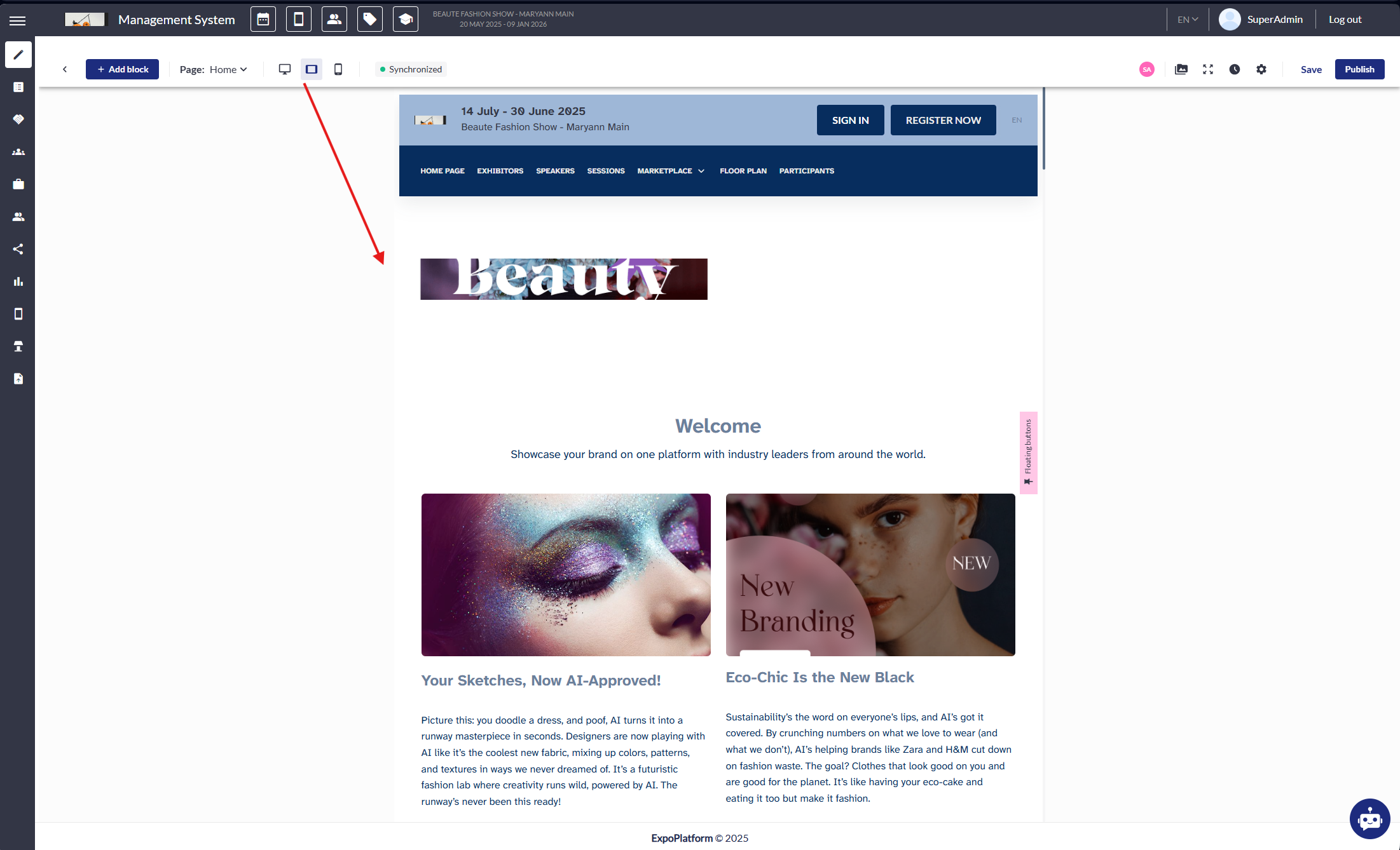
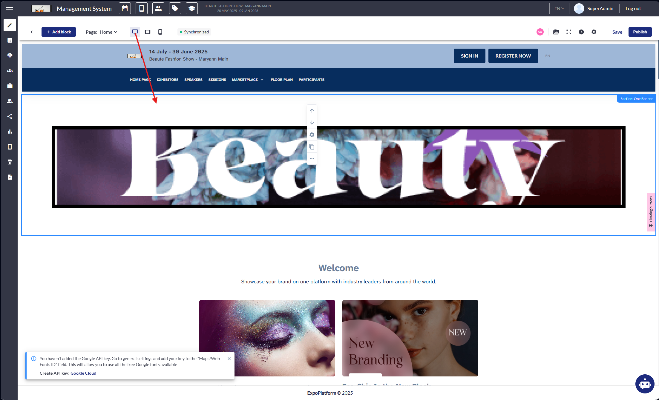
At the top of the preview window, toggle between Mobile, Tablet, or Desktop viewports.
Preview Modes Explained
1. Mobile View
-
Purpose: Emulates small-screen devices (typically 320px–480px wide).
-
What to Check:
-
Are navigation menus collapsible and accessible?
-
Do images scale properly without distortion?
-
Are buttons large enough for touch interaction?
-
Is the text readable without zooming?
-
-
Common Design Risks:
-
Overlapping elements due to fixed-width containers.
-
Hidden content caused by incorrect stacking.
-
2. Tablet View
-
Purpose: Represents medium screen sizes (768px wide).
-
What to Check:
-
Does content layout gracefully adapt from single-column to multi-column?
-
Is touch navigation still user-friendly?
-
Are large banners or carousels resizing correctly?
-
-
Common Design Risks:
-
Spacing issues when desktop elements shrink but do not reflow.
-
Vertical scroll overflow due to poorly defined container heights.
-
3. Desktop View
-
Purpose: Emulates wide-screen layouts (1024px and above).
-
What to Check:
-
Are headers, footers, and main content sections well-aligned?
-
Are high resolution assets displaying crisply?
-
Do hover effects and desktop-specific interactivity behave as expected?
-
-
Common Design Risks:
-
Large white space due to underutilized wide screens.
-
Mobile-first layouts that don’t fully take advantage of desktop real estate.
-
Optimizing for Each View
To ensure visuals and layouts render correctly:
-
Image Size Recommendations:
-
Event Logo: 1920x600 px
-
Session Image: 670x400 px
-
Session Background: 1920x1080 px
-
News Image: Square (e.g. 275x275 px)
-
Header Banners: Full width (responsive)
-
-
Text Considerations:
-
Avoid fixed font sizes; use responsive units (em/rem/%).
-
Don’t centre large text blocks on mobile, stick to left alignment for readability.
-
-
Components & Blocks:
-
Use flexible grid layouts (CSS Grid/Flexbox if custom CSS is used).
-
Define mobile-specific visibility settings when editing page blocks.
-
Troubleshooting:
Issue 1: Preview Not Loading
-
Check:
-
Your browser version, update to the latest.
-
JavaScript errors in DevTools console.
-
Your internet connection.
-
-
Fix:
-
Refresh the page (Ctrl+F5).
-
Clear cache/cookies.
-
Try using Incognito Mode or switching browsers.
-
Issue 2: View Modes Not Switching
-
Check:
-
Whether your session is still active, re-login if needed.
-
Try disabling ad blockers or browser extensions that interfere with JS.
-
-
Fix:
-
Reload the editor.
-
Check permissions, some restricted roles may not have access to preview all page types.
-
Issue 3: Content Doesn’t Match Final Website
-
Check:
-
If the page was saved before previewing.
-
Whether caching is preventing updates.
-
-
Fix:
-
Re-save the page and perform a hard refresh.
-
Ask another admin to preview it to rule out local issues.
-