Each button within a block has various appearance options that can be adjusted to fit your needs.
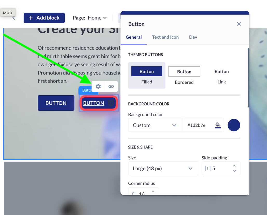
The general settings include:
-
Button Styles:
-
Filled: A solid color button.
-
Outline: A button with a border and no fill.
-
Link: A text-only button that functions as a hyperlink.
-
-
Background Color:
-
Choose the background color of the button from a color palette.
-
-
Size and Width:
-
Adjust the overall size and width of the button to ensure it fits your design layout.
-
-
Corner Radius:
-
Modify the corner radius to change the button's shape from square or rectangular to round or oval.
-
-
Border:
-
Select the color and thickness of the button's border to enhance its appearance.
-
-
Shadow:
-
Customize the button shadow by selecting the style and color.
-
Adjust the size, blur level, and position on the X and Y axes to create the desired shadow effect.
-
Users can also personalize the text within the button. The text settings available are:
-
Add or Remove Text:
-
Easily add text to the button or choose to have no text.
-
-
Text Input Fields:
-
Enter the desired text in the provided input fields.
-
-
Text Color:
-
Select the text color from a color palette.
-
-
Font Selection:
-
Choose the font by its name to match your website's overall theme.
-
-
Text Weight and Style:
-
Adjust the text weight (e.g., bold, regular) and other styles to achieve the preferred look.
-
-
Uppercase Letters:
-
Opt to display text in all uppercase letters for emphasis.
-
-
Text Decoration:
-
Choose to have the text underlined or struck through for additional styling options.
-
Users also have the option to use an icon instead of text on the button. The icon settings include:
-
Icon Selection:
-
Select an icon from a predefined set of options.
-
-
Icon Customization:
-
Adjust the color, size, rotation, and position of the icon on the button to align with the desired look and feel.
-