Overview:
Email builder is a component of our platform that is used for creating and editing email templates.
It is located in all the places in our platform where email templates are used:
-
Registration emails
-
Messaging in Networking & Matchmaking
-
Emails in Hosted Buyers Management
The builder itself is the same in all of these places. The only differences are the variables avaiable in each area of the platform. .
Elements of Email Builder:
General info
-
Template Name Field:
-
A mandatory field to input the name of the template.
-
Copy Template From:
-
To duplicate the selected template into the current one for quick edits.
-
Subject
-
A text field to specify the subject line of the email template.
-
From Name
-
A field to input the sender’s name that will appear in the “From” section of the email. As specified in the tooltip special characters cannot be included
-
From Email
-
Email Prefix Field: Allows editing the prefix of the sender’s email address.
-
Domain: Displays the domain part of the email address. It can be either our internal domain (expoplatform.com) or an external one.
-
-
Reply To
-
A field to specify the “Reply-To” email address for responses.
Blocks
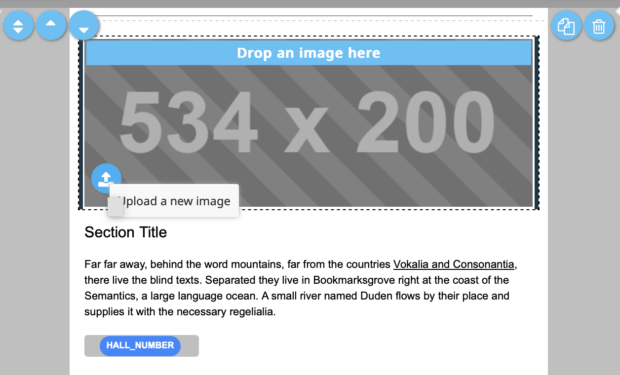
Blocks can be inserted into the email by using drag&drop. These can be text blocks, pictures, mixed blocks with text and images, divider, and footer of the email.
Blocks have the following options (may vary based on the type of the block):
-
Drag&Drop tool - for moving the block to the desired position withing the email template.
-
Buttons UP and DOWN for positioning a block over the next upper or lower one.
-
Copy button - for copying the block.
-
Delete button
-
Upload new image - only for the blocks that have images.
-
Button - can be as a part of the block or a separte block.
Editor panel
Clicking on the text in block summons the text editor. The elements of text editor:
-
Bold (B): Applies bold formatting to the selected text.
-
Italic (I): Applies italic formatting to the selected text.
-
A dropdown: Provides options for picking a color for the selected text.
-
A dropdown with a bar: Allows you to change the background color of the selected text.
-
Horizontal line - divider between the texts.
-
Formats: Dropdown menu with additional formatting options:
-
Headings. Provides a list of heading styles, typically ranging from Heading 1 (largest, used for main titles) to Heading 6 (smallest, used for subheadings or less important titles).
-
Inline:
-
Bold: Makes text bold.
-
Italic: Makes text italicized.
-
Underline: Underlines the text.
-
Strikethrough: Strikes through the text.
-
Superscript: Places text slightly above the normal line (e.g., for exponents).
-
Subscript: Places text slightly below the normal line (e.g., for chemical formulas).
-
Code: Formats text as inline code, with a monospace font and a different background.
-
-
Blocks Dropdown.
-
Paragraph: Regular block of text.
-
Blockquote: Formats text as a quotation by positioning it a bit separately from the rest of the text.
-
Div: Defines division in the text. By default, a paragraph of text in the email builder is wrapped in <p> tags. However, if you apply the <div> formatting to the entire text of the paragraph or just a part of it, the wrapping will change from <p> to <div>.
-
Pre.
-
-
-
Clear Formatting (Tx): Removes any formatting from the selected text, reverting it to plain text.
-
Insert/Edit Link: Allows you to add or edit a hyperlink for the selected text.
-
Remove link: Removes a hyperlink from the selected text.
-
Paste as Plain Text: Pastes text as plain text, stripping away formatting.
-
Source Code (<> icon): Switches to a source code view to edit HTML directly.
-
Insert Variable (+ Insert variable): Adds a placeholder or predefined variable into the text.
-
Settings (Gear icon): Opens settings for the variables.
Content
-
Show Title: A toggle switch to enable or disable the display of the title within the block.
-
Show Button: A toggle switch to enable or disable the display of a button within the block.
-
Show Image: A toggle switch to enable or disable the display of an image within the block.
Image
-
Clickable Image: A text field to input a URL or link for the image to make it clickable. This allows the image to redirect users to a specific location when clicked.
-
Alternative Text: A text field to specify alternative text for the image. This text is used for accessibility (e.g., screen readers) and is displayed if the image fails to load.
Button
-
Link: A text field to input a URL or link for the button. Clicking the button will redirect users to the specified link. Button. It’s possible to insert a variable in the link field so it will be personalized for the users.
Footer
-
Show Footer: A toggle switch to enable or disable the display of a footer on the page.
Style
-
Background Color: you can modify the background color for the block or page using a color picker or by entering a hex code.
-
External Background: the color of the outer area of the block.
Text
Font: A dropdown to select the font type (currently set to Arial) for the title.
Color:
-
Displays the current text color for the title.
-
Editable via a color picker or by entering a hex code.
Size:
-
Displays the font size for the title.
-
Editable via a numerical input field.
Top panel
-
Undo:
-
A button to revert changes made to the design or content.
-
The number in parentheses indicates the number of undoable actions currently available.
-
If grayed out, it suggests there are no undoable actions at the moment.
-
Redo:
-
A button to redo actions that were undone.
-
If grayed out, it suggests there are no redoable actions at the moment.
-
Gallery:
-
Opens a gallery or library, for adding images.
-
Show Live Preview (Mobile Icon):
-
Toggles a live preview of the content, allowing the user to see how the email appears on a device.
-
Test (Paper Plane Icon):
-
A button to initiate a test by sending an email to the email address inserted in the emerged modal window.
-
Download:
-
Provides an option to download the email template.
The system shows a warning message if changes made to the template are not saved or if you are trying to save an empty email template.
These pop-ups appear only if the user is clicking on any of the buttons within the area in the red frame. If we use the browser navigation buttons (move to another website, move back to the current page, open another tab etc) these pop-ups are not displayed.