System Blocks : New Website Builder
The use of system blocks simplifies the website development process by providing standardized and customizable elements that can be easily integrated to create a cohesive and visually appealing website.
This article explains how to use system blocks while building your website on ExpoPlatform. It would explain how the system blocks can be best used as per your event requirement and how it seamlessly incorporates your event data, enhancing the visual appeal of your site.
Navigate to Admin Panel → Event Setup → Build Website → Click on Edit Website → Click on Add Block on top left of the screen → Dynamic/Platform Block → Select the block you wish to use
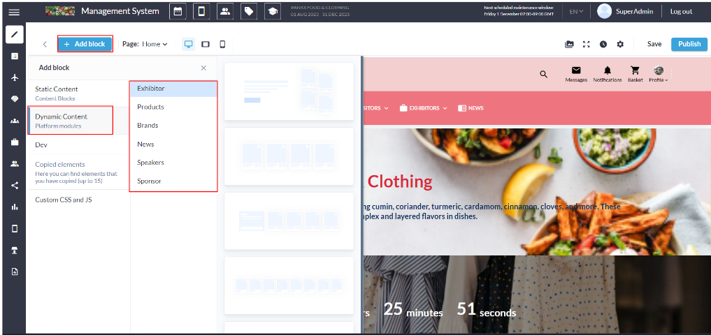
Dynamic/Platform Block
News Block
The News Block in our website builder is a feature-rich component that empowers users to create dynamic and engaging displays for news articles. This block offers various customizable settings to cater the diverse preferences, ensuring a seamless and visually appealing presentation of news content.
There are three distinct layouts available for the News block, offering organizers diverse design choices for showcasing news articles. Each variation incorporates specific settings to elevate visual appeal and enhance user engagement.
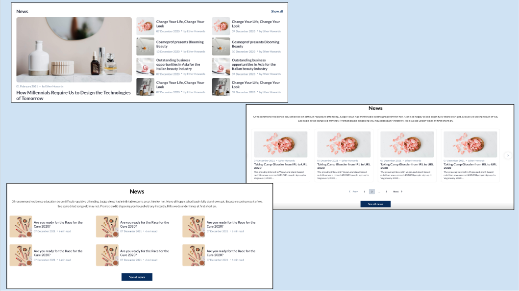
Distinct Layouts: News Block
Customization/Settings Available for News Block
Set the number of cards per row and max number of cards
Sorting - News by latest to be shown on top
Configure news based on product categories for display in the block.
Set which tags' news will be displayed in the block.
Set which news to show - All, Organizer, Exhibitors.
Search for specific news to add them for showing in the block
Style Settings
Click on the settings icon on the New Block to manage the below settings Background Color/Image: Choose a background color to set the tone or upload an image for a visually appealing backdrop, aligning with the overall theme of the news block. Title ON/OFF: Toggle On the display of the section title, providing users with the flexibility to showcase or hide the title based on design preferences. Description Settings:
Button ON/OFF: Include or exclude a button within the block for a clear call-to-action, guiding users to read more or take specific actions related to the news articles. Padding (Top, Bottom): Fine-tune the spacing around the entire news block to ensure optimal visual balance and emphasis, maintaining consistency with the overall design. | 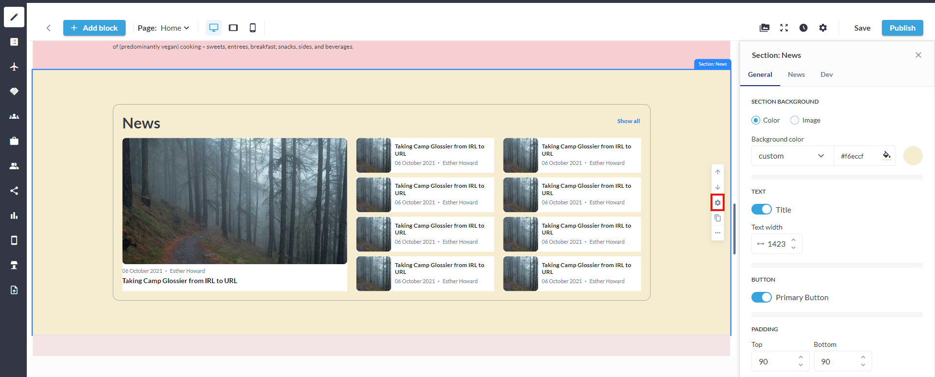 Settings: News Block 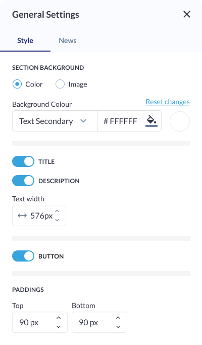 Style Settings: News Block |
Carousel Settings
Click on the settings icon of the Carousel Block to manage the below settings Carousel Type: Allows organizers to choose the type of carousel to be displayed, providing them with options for various carousel layouts or styles. Specify whether it's a traditional carousel, a multi-row carousel, or another visually appealing type. Total Number of Cards: Define the total number of cards to be displayed in the carousel, allowing organizers to control the quantity of content visible at a given time.
The default sorting for the News Block is "Latest News is shown on the Top." | 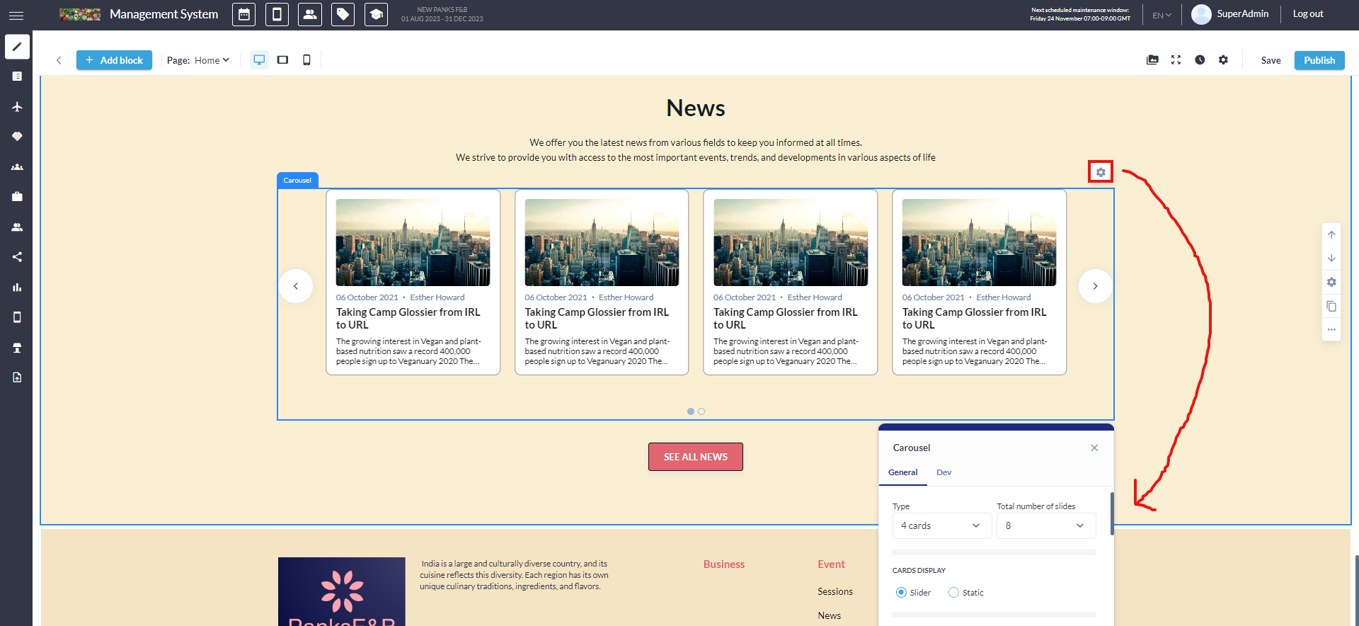 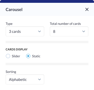 Carousel Setting: News Block |
Card Settings
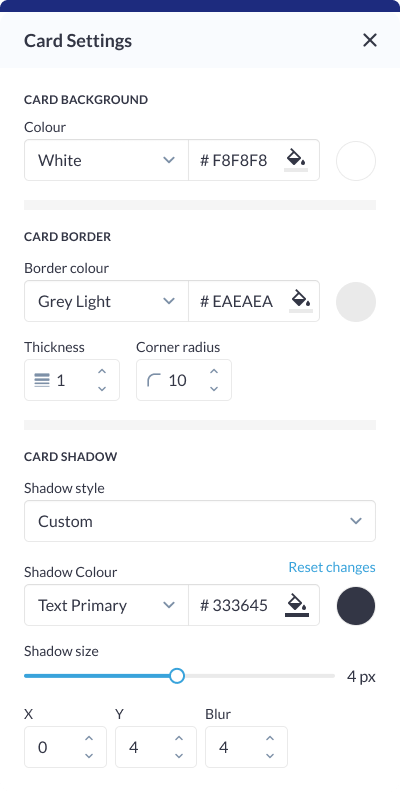
Click on the settings icon of the Card Block to manage the below settings News Description: Control the visibility and formatting of the news article description on the card, ensuring organizers to have the flexibility to present concise or detailed information. News Date Display: Determine how the news date is displayed on the card, allowing for various formats or styles. Author Display: Allows organizes to choose whether to display the author's name on the card, providing flexibility in presenting the contributor of the news article. Background Colour: Customize the background color of each card to match the overall theme or create visual contrast within the news block. Card Border:
Padding (Top, Left, Right, Bottom): Fine-tune the spacing around the card content to ensure optimal visual balance and alignment within the news block. Card Shadow:
|  Card Setting 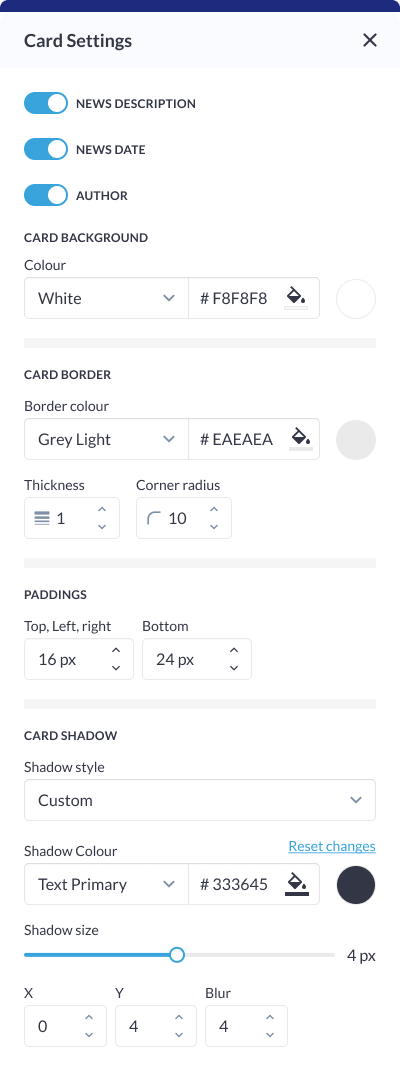 Card Settings: News Block |
News Settings
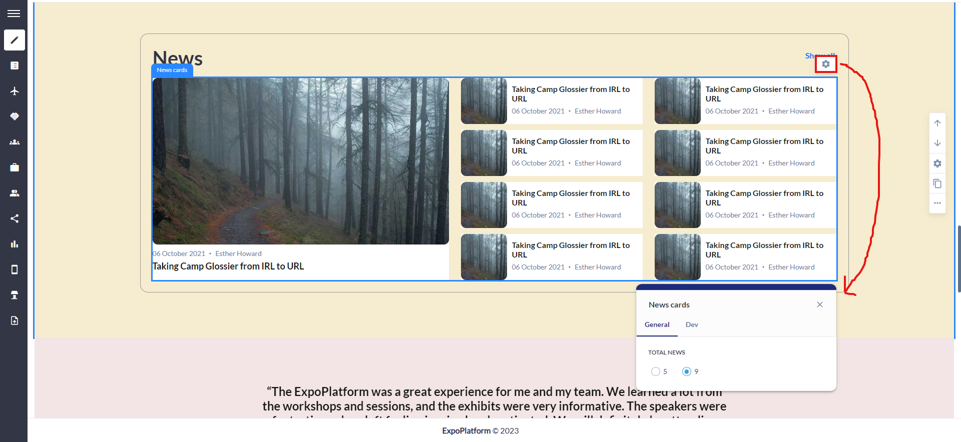
Click on the settings icon of the News Block to manage the below settings Tag Selection: Choose specific news tags to be associated with the news articles displayed in the block. This allows organizers to categorize and organize news content based on themes or topics. Source Selection(News to Show): Select the source of news articles to be displayed, providing options such as showing news from all sources, only organizers, or specifically from exhibitors. This customization offers flexibility in tailoring the content to specific contributors. Product Category Selection: Specify product categories associated with the news articles to create thematic groupings. This allows users to focus on news related to specific product categories. Date Filter: Set a start date to determine the range of news articles to be displayed. This feature enables users to showcase recent news or highlight specific periods of interest. Custom News Selection: Choose specific news articles to be included in the block, providing users with a curated approach to content presentation. This selection could also involve searching for news associated with exhibitors for added flexibility. | 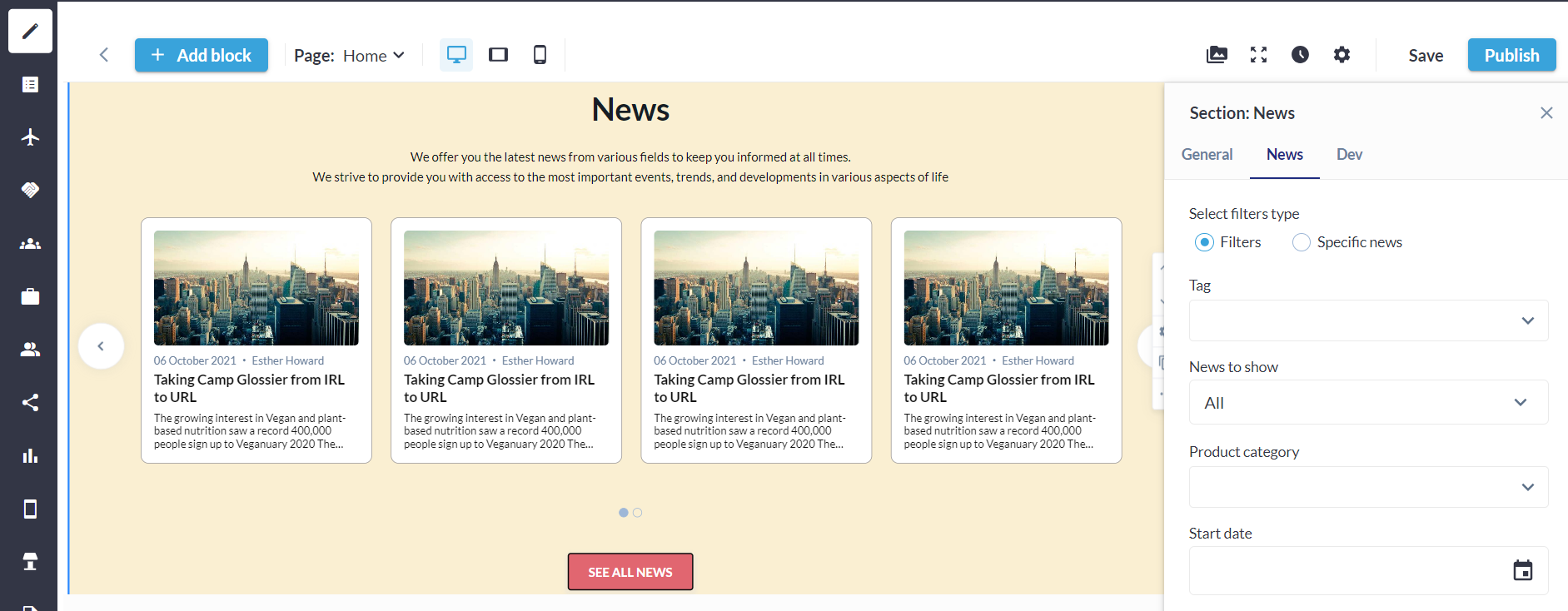 News Setting Block 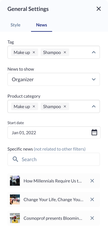 News Settings |
Different layout have different elements that can be customised using element blocks
Product Block
The Products Block in our website builder stands as a comprehensive solution for businesses, exhibitors, and website owners seeking a dynamic and visually striking means to showcase their products. There are five distinct layouts designed, each offering unique display options, this block is designed to meet the diverse needs of users who prioritize flexibility, customization, and performance ensuring that organisers can select the most fitting layout for their products.
There are five distinct variations available to the Product Block allowing organizers to choose the presentation style that best suits their website aesthetics. This feature is particularly valuable for large events or websites with extensive exhibitor databases.
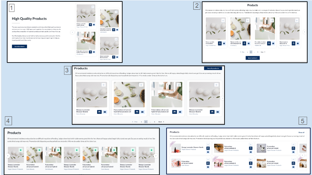
Distinct Layout: Product Block
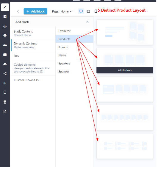
Distinct Product Layout
Customization/Settings Available for Product Block
Blocks can be configured to function as either a slider or a static block.
Number of cards per row and max number of cards.
Sorting - Alphabetical and Random.
Set products based on product categories that will be shown in the block.
Search for specific products to add them to the block
Select the information to display on the product card: Product name, Exhibitor name, Stand name. You can choose various combinations or none at all.
Other usual block settings.
Style Settings
Background Color/Image: Choose a background color to complement the overall theme or upload a custom image for a personalized touch, setting the tone for the entire section. Title ON/OFF: Toggle On to the display of the section title for enhanced flexibility in design, allowing organizers to feature the title prominently or maintain a cleaner, minimalist look. Description ON/OFF: Control the visibility of the section description to provide additional context or maintain a streamlined appearance based on the specific content strategy. Text Width (Desktop): Adjust the width of text content exclusively for desktop viewing, ensuring optimal readability and layout. On vertical tablets and mobile devices, text width extends across the entire screen width for a responsive and consistent design. Divider Settings:
Button ON/OFF: Incorporate or hide a button for a clear call-to-action, guiding users to take specific actions within the section. Padding (Top, Bottom): Fine-tune the spacing around the section to achieve the desired visual balance and emphasis, ensuring content is well-aligned and visually appealing. | 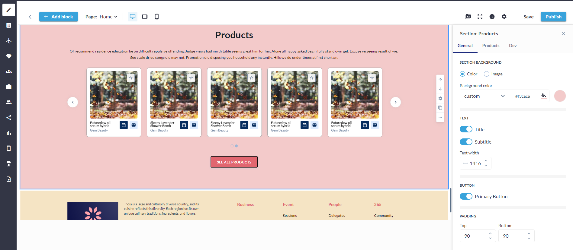 Product Setting Block 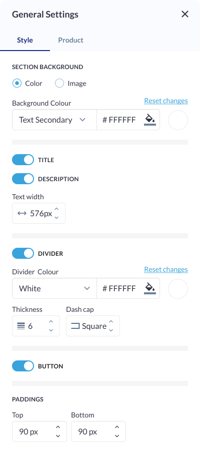 Style Setting: Product Block |
Carousel Settings
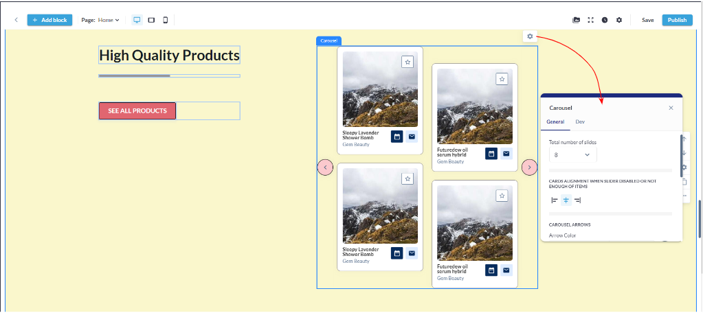
Total Number of Cards: Define the total number of cards to be displayed in the carousel, allowing organizer to control the quantity of content visible at a given time. Arrows Settings:
Autoplay Slideshow ON/OFF: Enable or disable automatic slideshow playback for a hands-free viewing experience. Each variation have the option to set whether it's a slider or a static block. Sorting Options:
|  Carousel Setting: Product Block  Carousel: Product Block |
Product Settings
 |  |
|---|
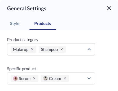
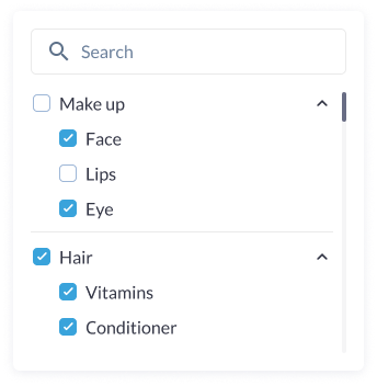
Product Category Selection: Organizers can choose specific product categories to be included in the display. This allows them to focus on particular types of products, ensuring relevance and thematic cohesion within the section.
Exhibitor Selection: Select specific exhibitors whose products will be featured in the section. This provides users with precise control over the exhibitors and their associated products, allowing for a curated showcase based on exhibitor preferences.
Card Settings
Background Colour: Customize the background color of each card to match the overall theme or create visual contrast within the section. Card Border:
Padding (Top, Left, Right, Bottom): Fine-tune the spacing around the card content to ensure optimal visual balance and alignment within the section. Card Shadow:
| 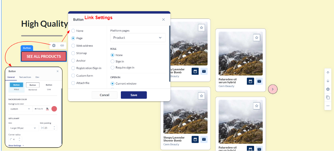 Button Settings  Card Setting: Product Block |
Different layout have different elements that can be customised using element blocks
Exhibitor Block
The Exhibitor Block is a dynamic and feature-packed element seamlessly integrated into our website builder, crafted to enhance the display of exhibitor information on websites. This feature accommodates a range of organizer needs, providing an extensive set of configurations for optimal customization and control over the presented content.
There are five distinct layouts available to the Exhibitor Block allowing organizers to choose the presentation style that best suits their website aesthetics. This feature is particularly valuable for large events or websites with extensive exhibitor databases. The integration of tags further refines content, allowing for a nuanced and personalized showcase.
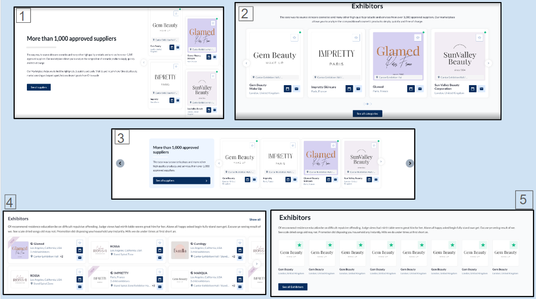
Distinct Layouts: Exhibitor Block
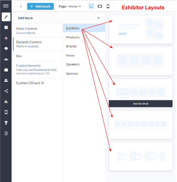
Exhibitor Layout
Customization/Settings Available for Exhibitor Block
Number of cards per row and max number.
Sorting - Alphabetical and Random.
Display exhibitors as per exhibitor categories in the block.
Display exhibitors according to their product categories, which will be showcased in the block.
Display exhibitors based on the tags that will be shown in the block.
Search for specific exhibitors to add them to the block.
Other usual block settings.
Style Settings
Background: Color/Image: Choose a background color that complements your website's theme or upload a custom image for a more personalized touch. The ability to customize the background ensures that the block seamlessly integrates into the overall design. Title: ON/OFF: Enable or disable the display of the block title to accommodate various design preferences. This feature is especially useful when the block's content should be the focal point without a title distraction. Description Settings: ON/OFF: Toggle the block description on or off based on your content strategy. This provides flexibility, allowing organizer to decide whether additional context is necessary for their audience. Text Width (Desktop): Adjust the width of the text content exclusively for desktop users. This responsive design feature ensures an optimized reading experience on larger screens without compromising the layout on smaller devices. Divider Settings:
Button Settings ON/OFF: Include or exclude a button within the block for a clear call-to-action. This can be particularly useful for driving user engagement or guiding visitors to specific content or actions. Padding (Top, Bottom): Adjust the padding around the block to control the spacing between the content and the block's borders. This feature ensures that the block integrates seamlessly into the overall page layout and maintains a polished appearance. | 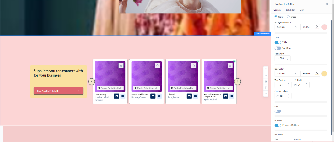 Exhibitor Block: General Setting 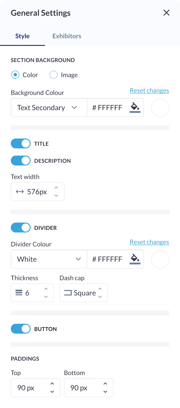 Styling Setting: Exhibitor Block |
Carousel Settings
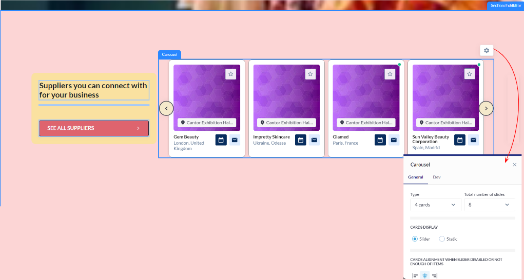
Total Number of Cards: Define the total number of cards to be displayed in the carousel, allowing users to control the amount of content visible at a given time. Arrows Settings:
Autoplay Slideshow:
Sorting Options:
|  Carousel: Exhibitor Block 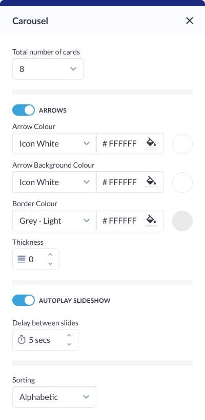 Carousel Setting: Exhibitor Block |
|---|
Exhibitors Settings
Exhibitor Category Selection: Choose specific exhibitor categories to be included in the display. This allows users to focus on particular types of exhibitors based on defined categories, ensuring relevance and thematic cohesion. Product Category Selection: Specify product categories associated with exhibitors to filter and showcase relevant exhibitors within the block. This feature is ideal for highlighting specific exhibitors Tag Selection: Incorporate exhibitors based on specific tags. This detailed tagging system enables organizer to curate content with precision, ensuring that only exhibitors with specific characteristics or attributes are featured in the block. Specific Exhibitors: Search and Select: Utilize a search functionality to find and add specific exhibitors to the block. This feature streamlines the process of content curation, especially in scenarios where users have a pre-defined list of exhibitors they wish to highlight. | 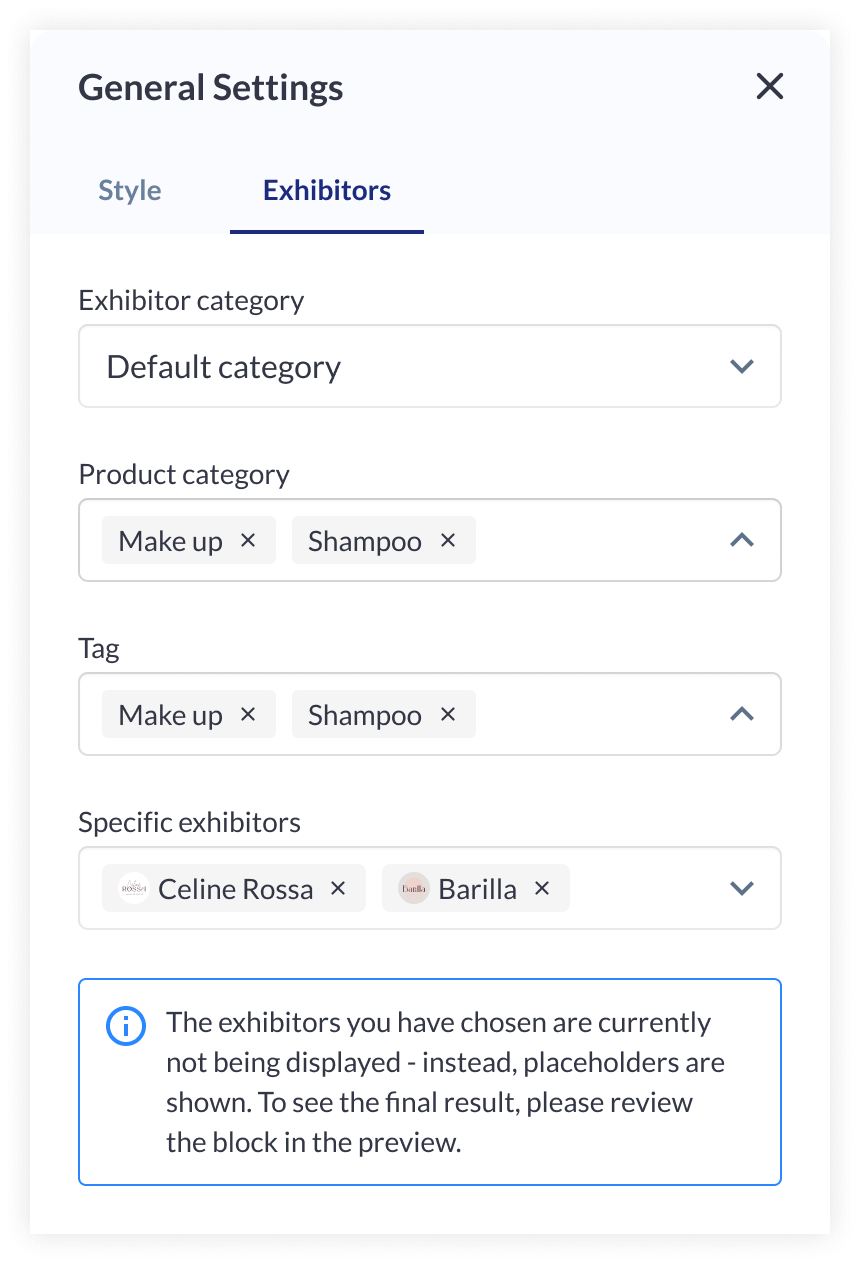 Exhibitor Setting: Exhibitor Block |
Card Settings
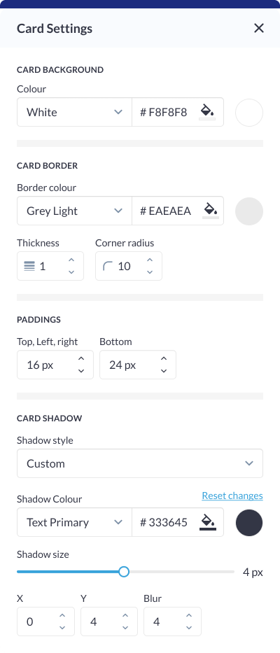
Background Color: Customize the background color of each card to match the overall theme or create visual contrast within the block. Card Border:
Padding (Top, Bottom): Fine-tune the spacing around the card content to ensure optimal visual balance and alignment within the block. Card Shadow:
|  Card Setting: Exhibitor Block |
Button Settings
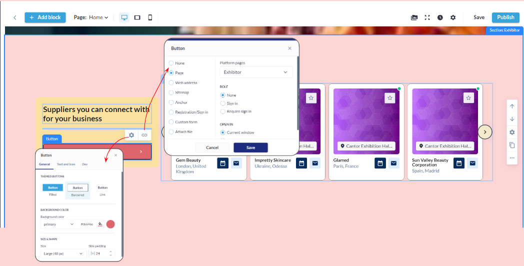
Button Type: Choose from various button types, such as standard, outlined, or textured, to match the desired visual style and design. Background Color: Customize the background color of the button to align with the overall color scheme or create a distinctive visual element. Size & Shape:
Border:
Shadow:
|  Button & Link Settings 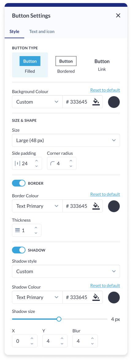 Button Setting: Exhibitor Block |
Static Block Settings
Block Type: Choose between different static block types to determine the layout and presentation style that best suits your content and design goals. Number of Cards: Define the total number of cards to be displayed within the static block, allowing users to control the amount of content visible at a given time. Card Display Type: Select between Slider and Static display options. Choose "Static" for a fixed, non-scrolling presentation, providing a stable view of the content. Opt for "Slider" to enable dynamic, slide-based navigation through the cards. Sorting Options:
| 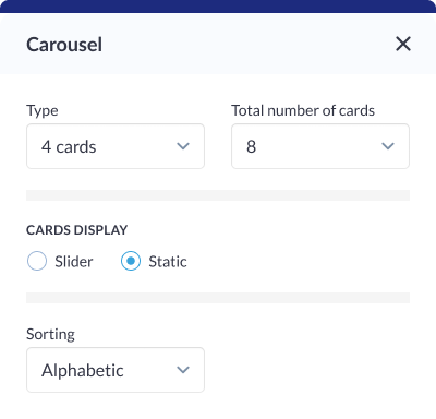 Static Block: Exhibitor Block |
Slider Setting
Slider Type: Choose the slider type that aligns with your design preferences, providing options for different visual styles and transitions. Number of Cards: Define the total number of cards to be included in the slider, allowing organizer to control the amount of content visible in each slide. Card Display Type: Select between Slider and Static options. Choose "Slider" for a dynamic, slide-based navigation through the cards. Opt for "Static" to present a fixed, non-scrolling view of the content. Arrows Settings:
Pagination: Organizer can choose to display dot or numbers to indicate the pages in the block Autoplay ON/OFF: Enable or disable automatic slideshow playback for a hands-free viewing experience. Sorting Options:
|  Slider Setting: Exhibitor Block |
Different layout have different elements that can be customised using element blocks
Speaker Block
There are three distinct layout blocks for Speakers, each with varying displays based on their individual settings.
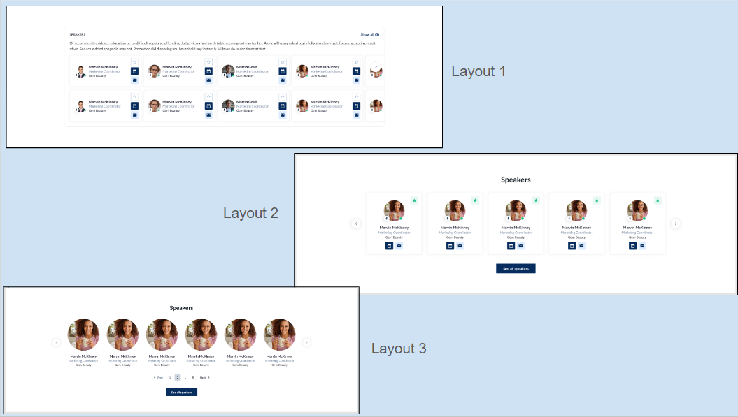
Speaker Layout: Frontend
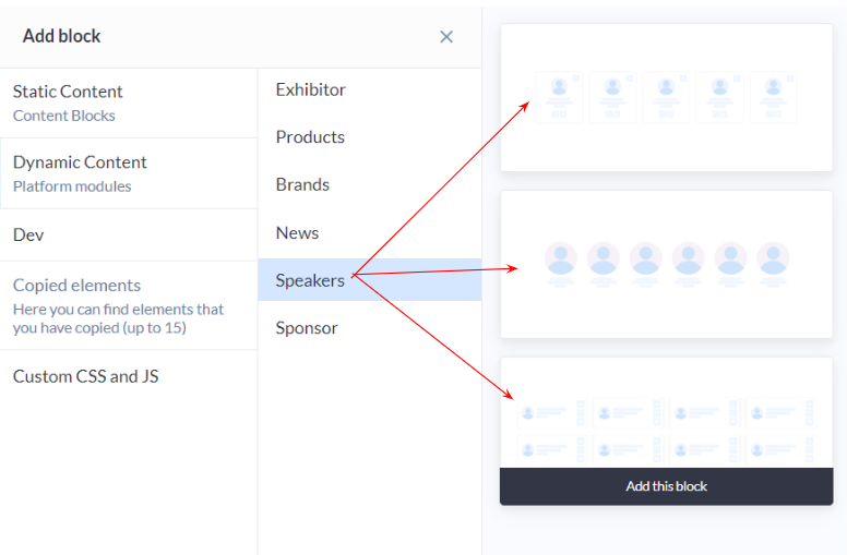
Speaker Layout: Admin Panel
Customization/Settings Available for Exhibitor Block
Blocks allow setting if it would be a slider or static block.
Number of cards per row and max number number of card
Sorting by Last Name - A-Z, Z-A, Random
Include speaker based on speaker tags which will be displayed in the block.
Search for a particular speaker to include in the block display
Other usual block settings.
Style Setting
Background Color/Image: Choose a background color to set the tone or upload an image, providing a visually appealing backdrop for the Speakers Block that aligns with the overall website theme. Title ON/OFF: Toggle the display of the section title, offering users the flexibility to showcase or hide the title based on their design preferences. Description Settings:
Divider: Include a divider for visual separation between the title and other content elements, providing a structured and organized appearance. Customize the divider's style to complement the overall aesthetic. Button ON/OFF: Include or exclude a button within the block for a clear call-to-action, guiding users to explore more details about the featured speakers or take specific actions related to the event. Padding (Top, Bottom): Fine-tune the spacing around the entire Speakers Block to ensure optimal visual balance and emphasis, maintaining consistency with the overall design.
|  |
|---|
Speaker Setting
Tag Selection: Choose specific speaker tags to be associated with the speaker cards displayed in the block. This allows users to categorize and organize speakers based on their expertise, topics, or any relevant theme. Individual Speaker Selection: Choose specific speakers to be included in the block, providing users with the flexibility to curate a showcase featuring particular individuals. |
Carousel Setting
Carousel Type: Choose the type of carousel to be displayed, specifying a slider for dynamic presentation of speaker cards. This provides an engaging and visually appealing way to showcase multiple speakers. Total Number of Cards: Define the total number of speaker cards to be displayed in the carousel, allowing users to control the quantity of content visible at a given time. Card Display - Slider: Specify the card display as a slider, creating a dynamic and interactive experience for users as they explore the featured speakers. Arrows Settings:
Pagination: Include pagination indicators for quick navigation between speaker cards, enhancing user experience and providing visual cues about the total number of cards in the carousel. Autoplay Slideshow: Enable or disable automatic slideshow playback for a hands-free and dynamic showcase of speaker cards. Define the delay between slideshows for optimal timing. Sorting Options:
|  Carousel Setting |
Card Setting
Background Colour: Customize the background color of each speaker card, allowing users to align the card's visual style with the overall theme of the website. Avatar Effect: Apply special effects to speaker avatars for added visual appeal, enhancing the overall presentation of speaker cards. Border on Hover:
Black & White Photo (Default):
Card Border:
Padding (Top, Left, Right, Bottom): Fine-tune the spacing around the speaker card content to ensure optimal visual balance and alignment within the carousel |  Card Setting |
Brand Block
Similar to the Exhibitor and Product block, the Brand block also has 4 distinct layouts each with varying displays based on their individual settings.
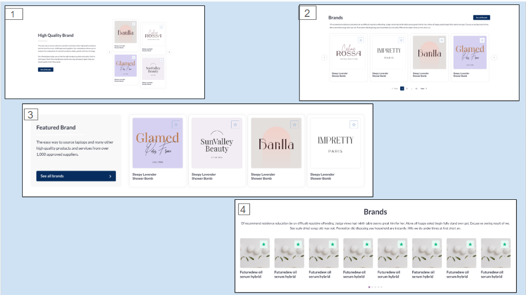
Brand Layout: Frontend
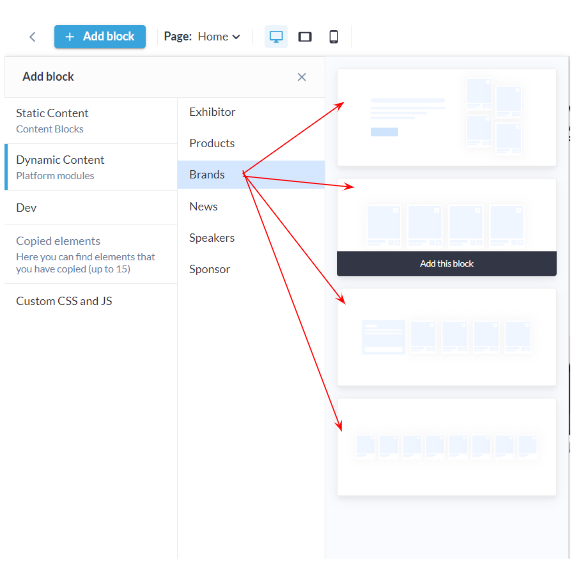
Brand Block: Admin Panel
Customization/Settings Available for Exhibitor Block
Blocks allow setting if it would be a slider or static block.
Number of cards per row and max number number of card
Sorting by Last Name - A-Z, Z-A, Random
Include brands based on product categories.
Search for a particular brand to include in the block display
Other usual block settings.
Style Setting
Background: Color/ Image: Customize the background with a choice of colors or upload an image to create a visually appealing backdrop for your content. Title and Description:
Text Width:
Divider:
Button: ON/OFF: Incorporate or hide buttons for a clear call-to-action or a streamlined aesthetic. Padding: Fine-tune the spacing above and below the content block, providing control over the visual balance and spacing within the layout. | 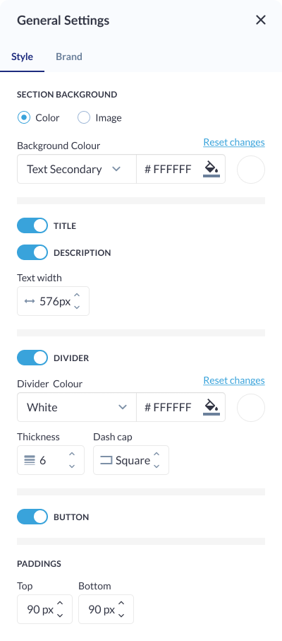 Style Settings |
Brand Settings
Select Exhibitor Category: Categorize brands based on exhibitor categories, providing a structured and organized display. Users can easily filter and navigate through brands associated with specific exhibitor categories. Select Product Category: Align brands with relevant product categories, allowing users to showcase brands based on the types of products or services they offer. This enhances user experience by presenting content in a targeted and contextually relevant manner. Tag: Implement a tagging system for brands, enabling users to add descriptive tags that highlight specific characteristics, features, or attributes associated with each brand. This facilitates easier organization and searchability of brands based on user-defined criteria. Specific Exhibitors: Provide users with the option to specifically select and showcase individual exhibitors or brands. This allows for a more curated and personalized presentation, especially useful for featuring key partners, sponsors, or highlighted brands. | 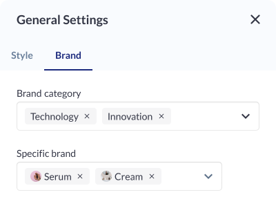 Brand Settings |
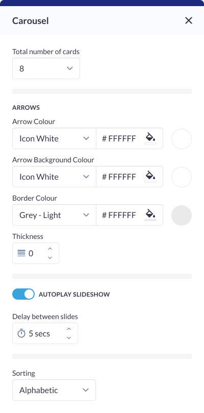
Carousel Settings
Type: Carousel Type: Choose the type of carousel, specifying the total number of cards visible at any given time. Options include a traditional carousel or a more expansive display with multiple cards. Arrows:
Autoplay Slideshow:
Sorting:
|  Carousel Setting |
Card Settings
Card Background: Choose a color or upload an image to set the background for each card, providing a distinct visual identity for individual elements. Card Border:
Description: Toggle the visibility of the description for each card, offering flexibility in content presentation. This is particularly useful for achieving a cleaner or more concise design. Card Shadow:
|  Card Settings |
