Skip table of contents

Sponsor Block: Website Builder

Within the website builder, the Sponsors Block plays a pivotal role, providing organizers with advanced platform settings to recognize and showcase the invaluable support of sponsors. This functionality extends beyond mere acknowledgement, presenting sponsors in a visually appealing and strategically organized manner.

There are five distinct layouts available for the Sponsor Block allowing organizers to choose the presentation style that best suits their website aesthetics.

How to add a Sponsor block

Navigate to Admin Panel → Event Setup → Build Website → Click on Edit Website → Click on Add Block on the top left of the screen → Dynamic/Platform Block → Click on Sponsor block → Finally select the layout in which you wish to showcase your sponsors
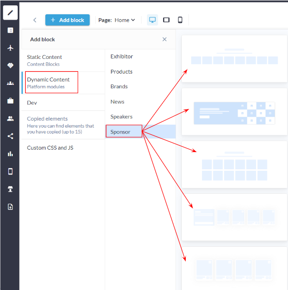
Sponsor Block: Admin Panel
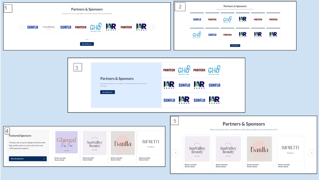
Sponsor Block Layout: frontend

Customization/Settings Available for Sponsor Block

  1. Blocks can be set as a slider or static block.

  2. Manage the number of cards per row and max number of cards that can be set for the block.

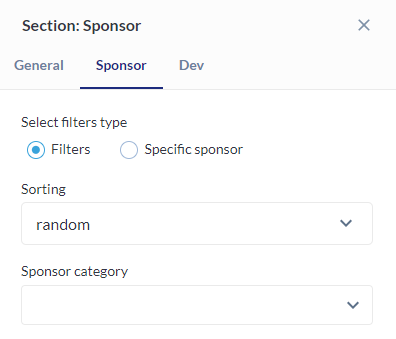
  3. Sorting - Alphabetical and Random.

  4. Display sponsors based on sponsor categories in the block.

  5. Search for specific sponsors to add them to the block.

  6. Other usual block settings.

Each layout in the sponsor block consists of the below elements and each of these can be customised by clicking on the settings icon of that particular element

  • General style setting

    • Title

    • Description

  • Sponsor Settings

  • Carousel Settings

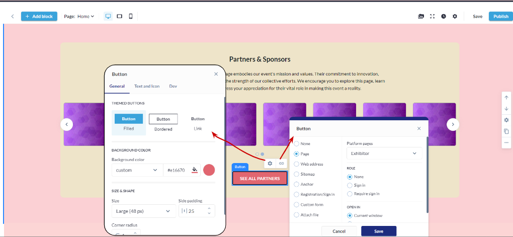
  • Button and Link Settings

Style

Background: Customize the background with a choice of colors or upload an image to create a visually appealing backdrop for the Sponsors Block.

Title and Description:

  • Title ON/OFF: Toggle the visibility of the title for each sponsor, offering flexibility in the level of information displayed.

  • Description ON/OFF: Choose whether to display additional descriptive text along with each sponsor, providing a layer of context to the audience.

Text Width:

  • Desktop: Adjust the width of the text content for desktop views, ensuring optimal readability and design.

  • Vertical Tablet and Mobile: Automatically spans the entire width to enhance responsiveness and adaptability.

Divider:

  • ON/OFF: Include or exclude dividers between sponsors for a structured or seamless appearance.

  • Divider Color: Customize the color of the divider to complement the overall design scheme.

  • Thickness: Control the thickness of the divider, allowing for subtle or bold separations.

  • Dash Cap: Choose from different dash cap styles to add a touch of sophistication to the dividers.

Button ON/OFF: Enable or disable buttons for each sponsor, providing a clear call-to-action or a streamlined aesthetic.

Padding: Top and Bottom: Fine-tune the spacing above and below the entire Sponsors Block, ensuring an optimal visual balance and spacing within the layout.

General Settings: Sponsor

Sponsor Settings

Sponsor Category Selection: Organizers can choose specific sponsor categories to be included in the display. This allows them to focus on particular types of sponsors, ensuring relevance and thematic cohesion within the section.

Sponsor Selection: Select specific sponsor that will be featured in the section. This provides organizers with precise control over the sponsor visibility.

Sorting:

  • A-Z and Z-A: Arrange carousel cards in alphabetical order, promoting a structured and organized presentation.

  • Random: Shuffle the order of carousel cards randomly, injecting an element of surprise and variety into the user experience.

Sponsor Settings

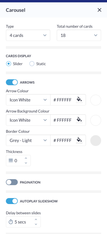
Carousel Settings

Click on the settings icon to manage carousel settings

Type: Specify the type of carousel for the Sponsors Block, determining the overall layout and presentation style.

Total Number of Cards: Define the total number of sponsor cards visible in the carousel, ensuring optimal content density and visual appeal.

Arrows:

  • Arrow Colour: Customize the color of navigation arrows for user-controlled browsing.

  • Arrow Background Colour: Set the background color behind the navigation arrows.

  • Border Colour: Define the color of the border surrounding the arrows.

  • Thickness: Adjust the thickness of the arrow border for prominence.

Pagination: Enable or disable pagination for a streamlined or detailed viewing experience.

Autoplay Slideshow:

  • ON/OFF: Enable or disable the autoplay feature, allowing the carousel to automatically transition between sponsor cards.

  • Delay Between Slides: Specify the time interval between each slide transition, providing control over the slideshow speed and pacing.

Carousel Settings

Carousel Settings

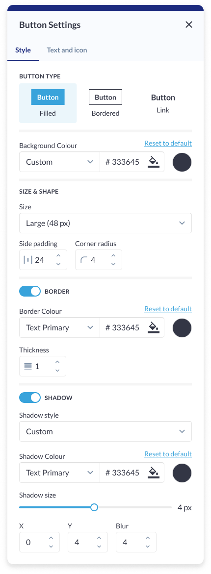
Button Settings

Button Type: Choose from various button types, such as standard, outlined, or textured, to match the desired visual style and design.

Background Color: Customize the background color of the button to align with the overall color scheme or create a distinctive visual element.

Size & Shape:

  • Size: Adjust the overall size of the button to suit the design and layout preferences.

  • Side Padding: Set the padding on the sides of the button for precise control over spacing and alignment.

  • Corner Radius: Define the corner radius to achieve rounded or squared corners, adding a touch of sophistication or modernity to the button's appearance.

Border:

  • Border Color: Specify the color of the border for enhanced visual contrast or seamless integration with the background.

  • Thickness: Adjust the thickness of the button border to control the prominence and emphasis of the button within the block.

Shadow:

  • Shadow Style: Choose a shadow style for the button, such as flat, raised, or inset, to add depth and dimension.

  • Shadow Color: Customize the color of the shadow to complement the overall design and create a cohesive visual effect.

  • Shadow Size: Adjust the size of the shadow to control the intensity and prominence, providing a subtle or more pronounced shadow effect.


Button Settings: Sponsor Block


Button Setting: Sponsor Block

Card Settings

Background Color: Customize the background color of each card to match the overall theme or create visual contrast within the block.

Card Border:

  • Border Color: Define the color of the border surrounding each card, allowing for seamless integration with the overall design.

  • Thickness: Adjust the thickness of the card border to achieve the desired visual emphasis.

  • Corner Radius: Set the corner radius to add a rounded or curved appearance to the edges of the card, enhancing its aesthetic appeal.

Padding (Top, Bottom): Fine-tune the spacing around the card content to ensure optimal visual balance and alignment within the block.

Card Shadow:

  • Shadow Style: Choose a shadow style for each card, such as flat, raised, or inset, to add depth and dimension.

  • Shadow Color: Customize the color of the shadow to complement the overall color scheme and enhance visual continuity.

  • Shadow Size: Adjust the size of the shadow to control the intensity and prominence, creating a subtle or pronounced shadow effect.


Card Setting: Exhibitor Block

Different layout have different elements that can be customised using element blocks

JavaScript errors detected

Please note, these errors can depend on your browser setup.

If this problem persists, please contact our support.