Speaker Block: Website Builder
Similar to other platform blocks, the speaker block can be employed by the organizer to showcase their speakers on the website. There are three distinct layout blocks for speakers, each offering varied displays based on their unique settings.
How to add Speaker Block
Navigate to Admin Panel → Event Setup → Build Website → Click on Edit Website → Click on Add Block on the top left of the screen → Dynamic/Platform Block → Click on Speaker block → Finally select the layout in which you wish to showcase your speakers.
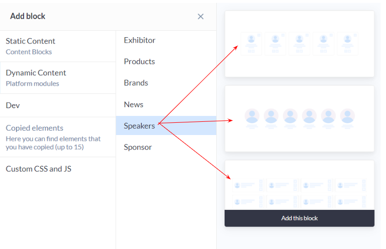
Speaker Layout: Admin Panel
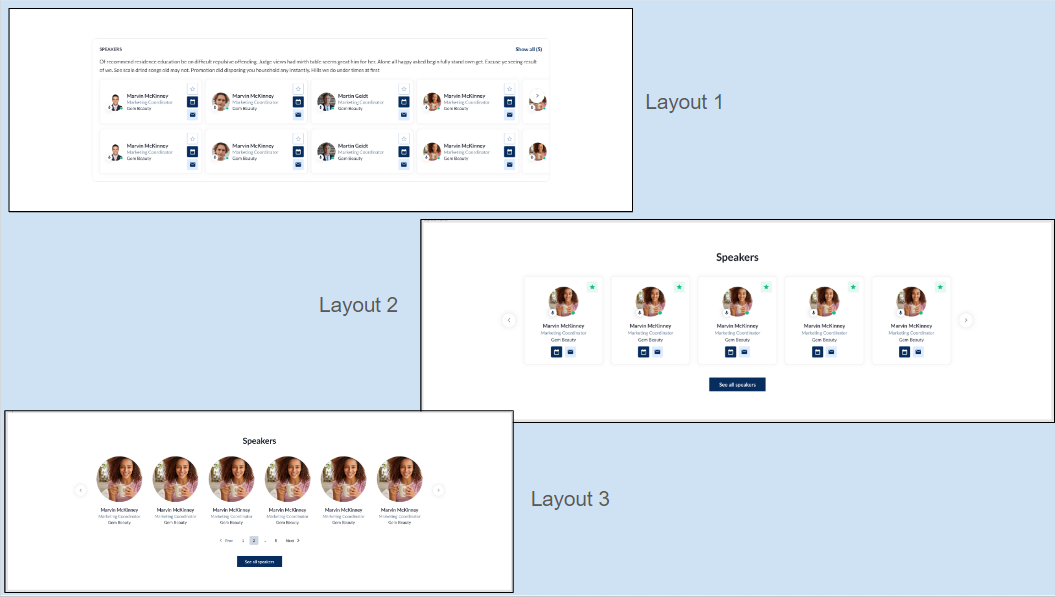
Speaker Layout: Frontend
Customization/Settings Available for Speaker Block
Blocks can be configured to function as either a slider or a static block.
Manage the number of cards per row and the maximum number of card
Sorting by Last Name - A-Z, Z-A, Random
Include speaker based on speaker tags.
Search for a particular speaker to include in the block display
Other usual block settings.
Each layout in the speaker block consists of the below elements and each of these can be customised by clicking on the settings icon of that particular element
General style setting
Title
Description
Speaker Settings
Carousel Settings
Button & Link Settings
Style Setting
Background Color/Image: Choose a background color to set the tone or upload an image, providing a visually appealing backdrop for the Speakers Block that aligns with the overall website theme. Title ON/OFF: Toggle the display of the section title, offering users the flexibility to showcase or hide the title based on their design preferences. Description Settings:
Divider: Include a divider for visual separation between the title and other content elements, providing a structured and organized appearance. Customize the divider's style to complement the overall aesthetic. Button ON/OFF: Include or exclude a button within the block for a clear call-to-action, guiding users to explore more details about the featured speakers or take specific actions related to the event. Padding (Top, Bottom): Fine-tune the spacing around the entire Speakers Block to ensure optimal visual balance and emphasis, maintaining consistency with the overall design.
| 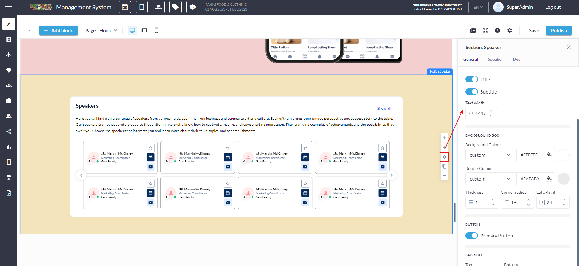 Speaker General Settings  |
|---|
Speaker Setting
Tag Selection: Choose specific speaker tags to be associated with the speaker cards displayed in the block. This allows users to categorize and organize speakers based on their expertise, topics, or any relevant theme. Individual Speaker Selection: Choose specific speakers to be included in the block, providing users with the flexibility to curate a showcase featuring particular individuals. Sorting Options:
|
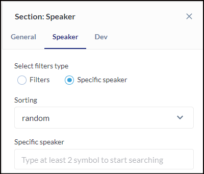 Speaker Settings |
Button Settings
Button Type: Choose from various button types, such as standard, outlined, or textured, to match the desired visual style and design. Background Color: Customize the background color of the button to align with the overall color scheme or create a distinctive visual element. Size & Shape:
Border:
Shadow:
| 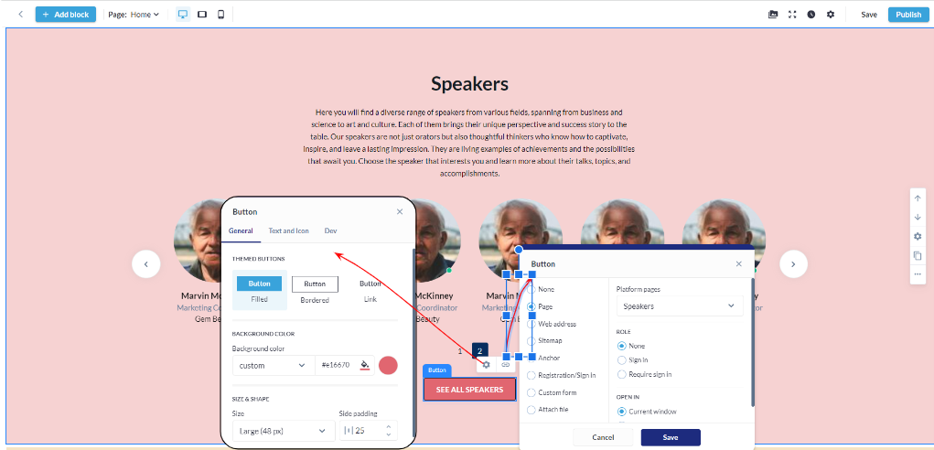 Button & Link Settings: Speaker Block
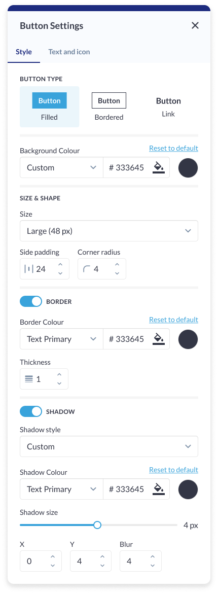 Button Setting: Speaker Block |
Carousel Setting
Carousel Type: Choose the type of carousel to be displayed, specifying a slider for the dynamic presentation of speaker cards. This provides an engaging and visually appealing way to showcase multiple speakers. Total Number of Cards: Define the total number of speaker cards to be displayed in the carousel, allowing users to control the quantity of content visible at a given time. Avatar Effect: Organizers can choose to display the speaker avatar as either small or large, depending on visual appeal, thereby enhancing the overall presentation of speaker cards. Card Display - Slider: Specify the card display as a slider, creating a dynamic and interactive experience for users as they explore the featured speakers. Arrows Settings:
Pagination: Include pagination indicators for quick navigation between speaker cards, enhancing user experience and providing visual cues about the total number of cards in the carousel. Autoplay Slideshow: Enable or disable automatic slideshow playback for a hands-free and dynamic showcase of speaker cards. Define the delay between slideshows for optimal timing. | 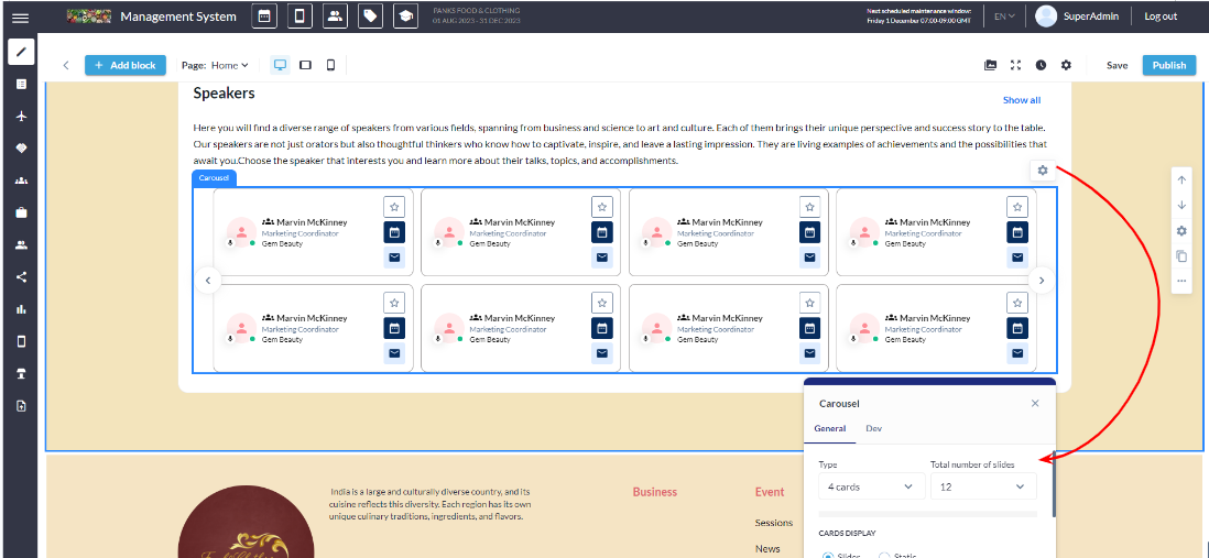 Carousel Settings 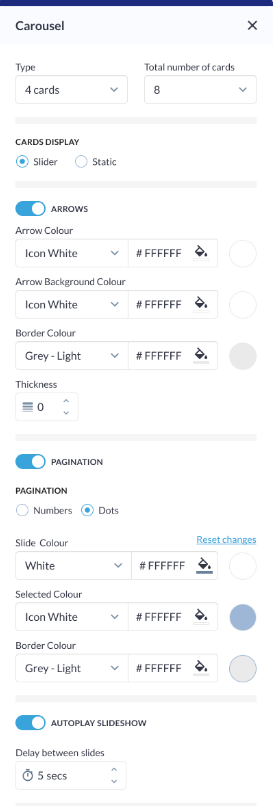 Carousel Setting |
Card Setting
Background Colour: Customize the background color of each speaker card, allowing users to align the card's visual style with the overall theme of the website. Border on Hover:
Black & White Photo (Default):
Card Border:
Padding (Top, Left, Right, Bottom): Fine-tune the spacing around the speaker card content to ensure optimal visual balance and alignment within the carousel | 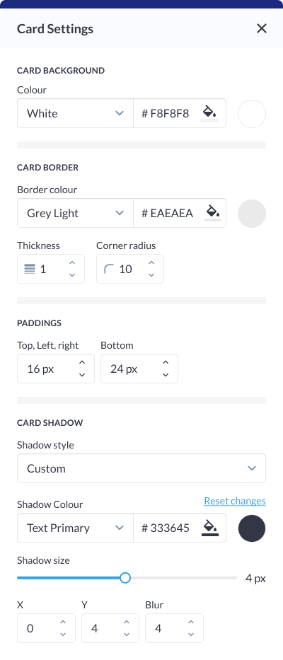 Card Setting |
Different layouts have different elements that can be customised using element blocks
