Session Block: Website Builder
Like other platform blocks the Session Block within a website builder stands as an indispensable tool for crafting engaging and strategic narratives around sessions and content. This dynamic feature not only presents information but transforms it into a visually compelling and seamlessly organized experience, catering to the needs of both organizers and attendees.
Beyond conventional sorting by alphabetic order, the Session Block introduces innovative sorting options. From alphabetical arrangements to inverted sequences and random shuffling, users can now even prioritize sessions based on a percentage of match. This level of customization elevates the sorting experience, adding a layer of dynamic organization.
There are three distinct layouts available for the Sponsor Block allowing organizers to choose the presentation style that best suits their website aesthetics.
How to add a Session block
Navigate to Admin Panel → Event Setup → Build Website → Click on Edit Website → Click on Add Block on the top left of the screen → Dynamic/Platform Block → Click on Session block → Finally select the layout in which you wish to showcase your sessions
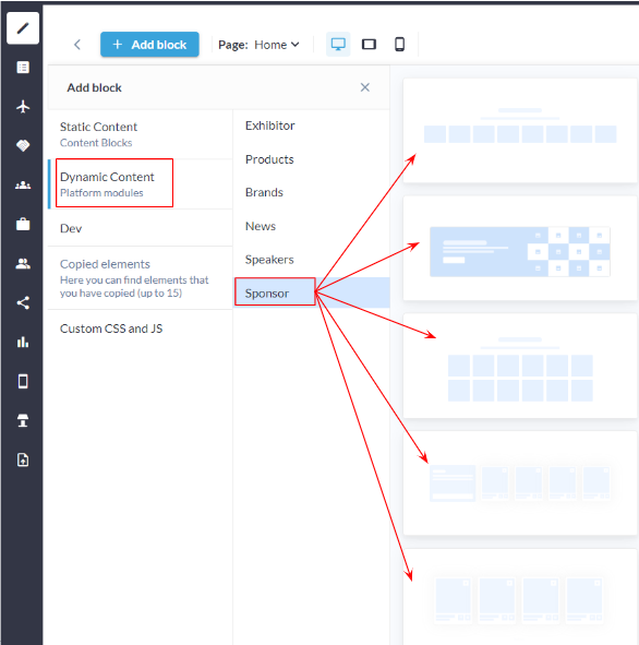
Sponsor Block: Admin Panel

Session Block: Frontend
Customization/Settings Available for Session Block
Blocks can be set as a slider or static block.
Manage the number of cards per row and max number of cards that can be set for the block.
Sorting - Alphabetical, Random and by % of match
Display session based on session tags, types and tracks in the block.
Display session based on the product categories
Configure whether the featured session should be displayed in the session block.
Search for specific sessions to add them to the block.
Other usual block settings.
Each layout in the sponsor block consists of the below elements and each of these can be customised by clicking on the settings icon of that particular element
General style setting
Title
Description
Session Settings
Carousel Settings
Button and Link Settings
Style
Background: Customize the background with a choice of colors or upload an image, establishing a visually appealing backdrop for the Session Block. Title and Description:
Text Width:
Divider:
Button: Incorporate or hide buttons for each session, providing a clear call-to-action or a streamlined aesthetic. Padding: Fine-tune the spacing above and below the entire Session Block, ensuring an optimal visual balance and spacing within the layout.
| 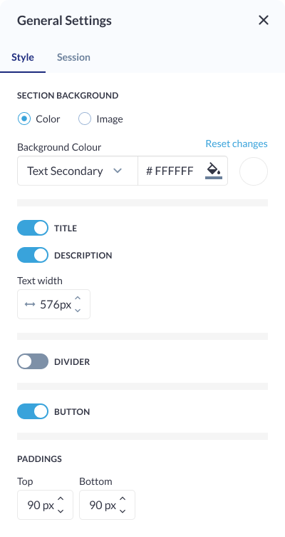 General Settings: Session Block |
Session Settings
Session Category: Categorize sessions based on relevant session categories, allowing for a strategic alignment of sessions with specific content themes or event topics. Track: Align sessions with specific event tracks, enhancing the contextual relevance of sessions and ensuring a cohesive content strategy throughout different program tracks. Type: Categorize sessions based on their type, such as workshops, keynotes, panels, etc. This classification provides clarity on the nature of each session and aids attendees in choosing sessions that align with their interests. Tag: Implement a tagging system for sessions, allowing users to add descriptive tags that highlight specific characteristics, industries, or themes associated with each session. This enables more granular organization and searchability. Featured Session: Highlight specific sessions as featured, providing a special designation for key or spotlighted content. Featured sessions can be showcased more prominently within the Session Block or on the website. Start Date: Specify the start date for each session, enabling chronological organization and providing attendees with a clear timeline of scheduled events. Specific Session: Users have the option to specifically link individual exhibitors or sponsors to sessions. This feature allows for a more curated and personalized presentation, especially useful for featuring key partners, sponsors, or exhibitors associated with specific sessions. Sorting:
| 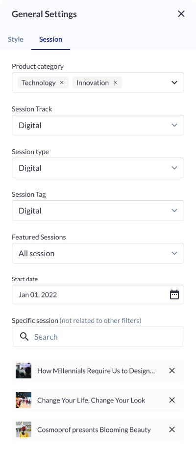 Session Settings
|
Carousel Settings
Click on the settings icon to manage carousel settings Type: Specify the type of carousel for the Session’s Block, determining the overall layout and presentation style. Total Number of Cards: Define the total number of session cards visible in the carousel, ensuring optimal content density and visual appeal. Arrows:
Pagination: Enable or disable pagination for a streamlined or detailed viewing experience. Autoplay Slideshow:
| 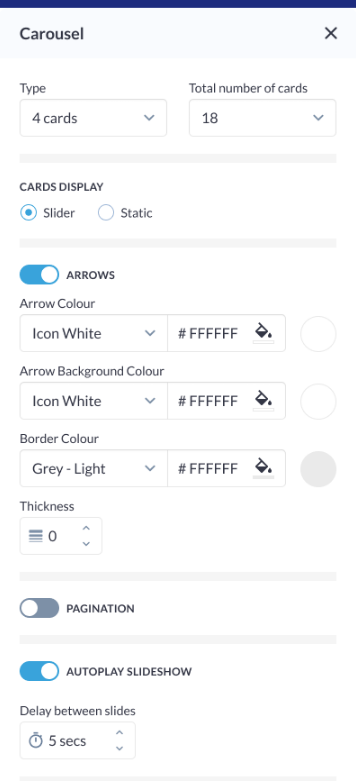 Carousel Settings
|
Button Settings
Button Type: Choose from various button types, such as standard, outlined, or textured, to match the desired visual style and design. Background Color: Customize the background color of the button to align with the overall color scheme or create a distinctive visual element. Size & Shape:
Border:
Shadow:
|
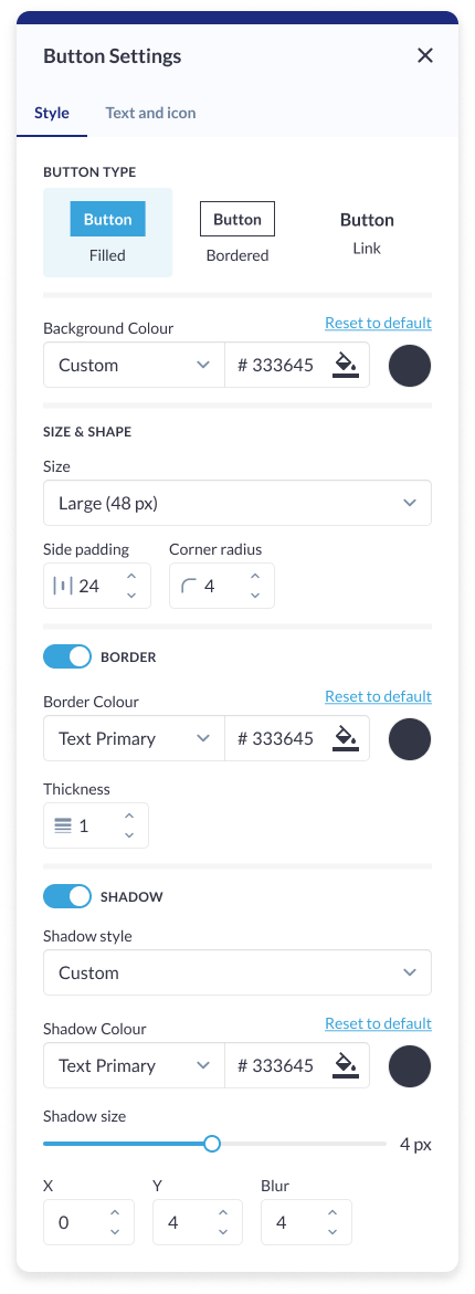 Button Setting: Sponsor Block |
Card Settings
Background Color: Customize the background color of each card to match the overall theme or create visual contrast within the block. Card Border:
Padding (Top, Bottom): Fine-tune the spacing around the card content to ensure optimal visual balance and alignment within the block. Card Shadow:
| 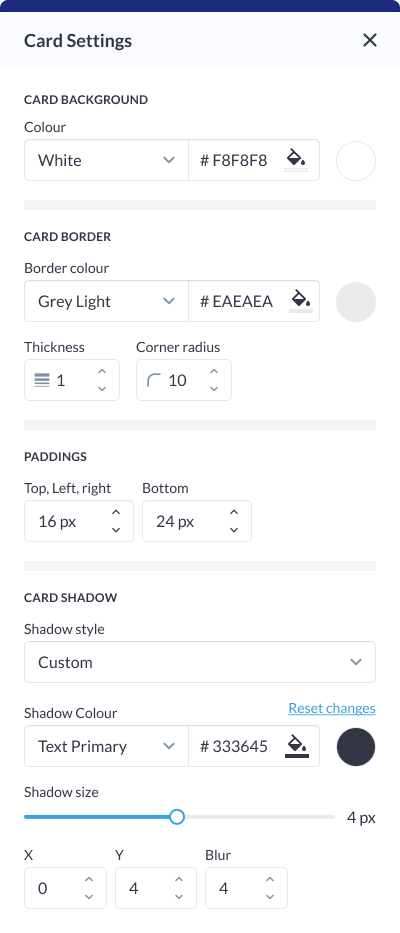 Card Setting: Exhibitor Block |
Different layout have different elements that can be customised using element blocks
Session Block doesn’t show the details of On Demand Session added to the event.
