News Block: Website Builder
The News Block in our website builder is a feature-rich component that empowers users to create dynamic and engaging displays for news articles. This block offers various customizable settings to cater the diverse preferences, ensuring a seamless and visually appealing presentation of news content.
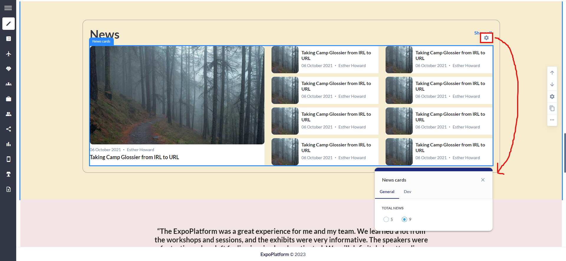
There are three distinct layouts available for the News block, offering organizers diverse design choices for showcasing news articles. Each variation incorporates specific settings to elevate visual appeal and enhance user engagement.
How to add a News Block
Navigate to Admin Panel → Event Setup → Build Website → Click on Edit Website → Click on Add Block on the top left of the screen → Dynamic/Platform Block → Click on News block → Finally select the layout in which you wish to display your news articles
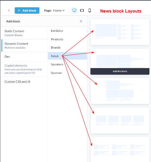
News block Layouts
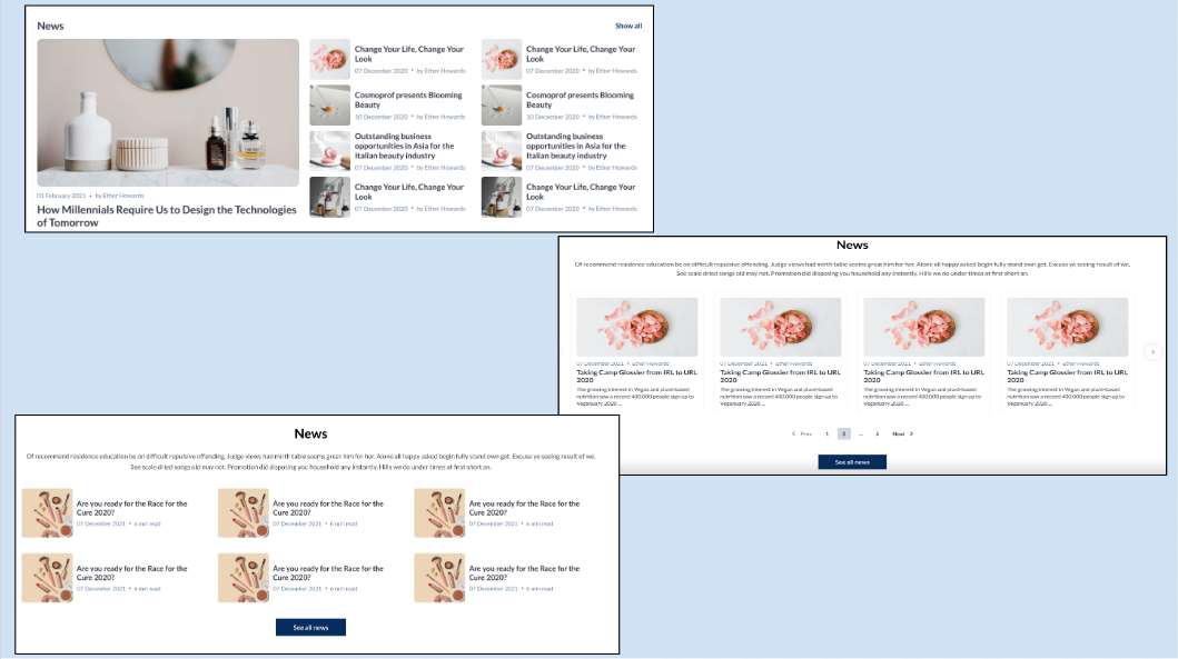
Distinct Layouts: News Block
Customization/Settings Available for News Block
Manage the number of cards per row and max number of cards
Sorting - The most recent news is displayed first.
Display news based on product categories.
Set which tags' news will be displayed in the block.
Set which news to show - All, Organizer, Exhibitors.
Search for specific news to add them for showing in the block
Each layout in the news block consists of the below elements and each of these can be customised individually by clicking on the settings icon of that particular element
General style setting
Title
Description
News Settings
Button & Link Settings
Carousel Settings
Style Settings
Click on the settings icon on the New Block to manage the below settings Background Color/Image: Choose a background color to set the tone or upload an image for a visually appealing backdrop, aligning with the overall theme of the news block. Title ON/OFF: Toggle On the display of the section title, providing users with the flexibility to showcase or hide the title based on design preferences. Description Settings:
Button ON/OFF: Include or exclude a button within the block for a clear call-to-action, guiding users to read more or take specific actions related to the news articles. Padding (Top, Bottom): Fine-tune the spacing around the entire news block to ensure optimal visual balance and emphasis, maintaining consistency with the overall design. | 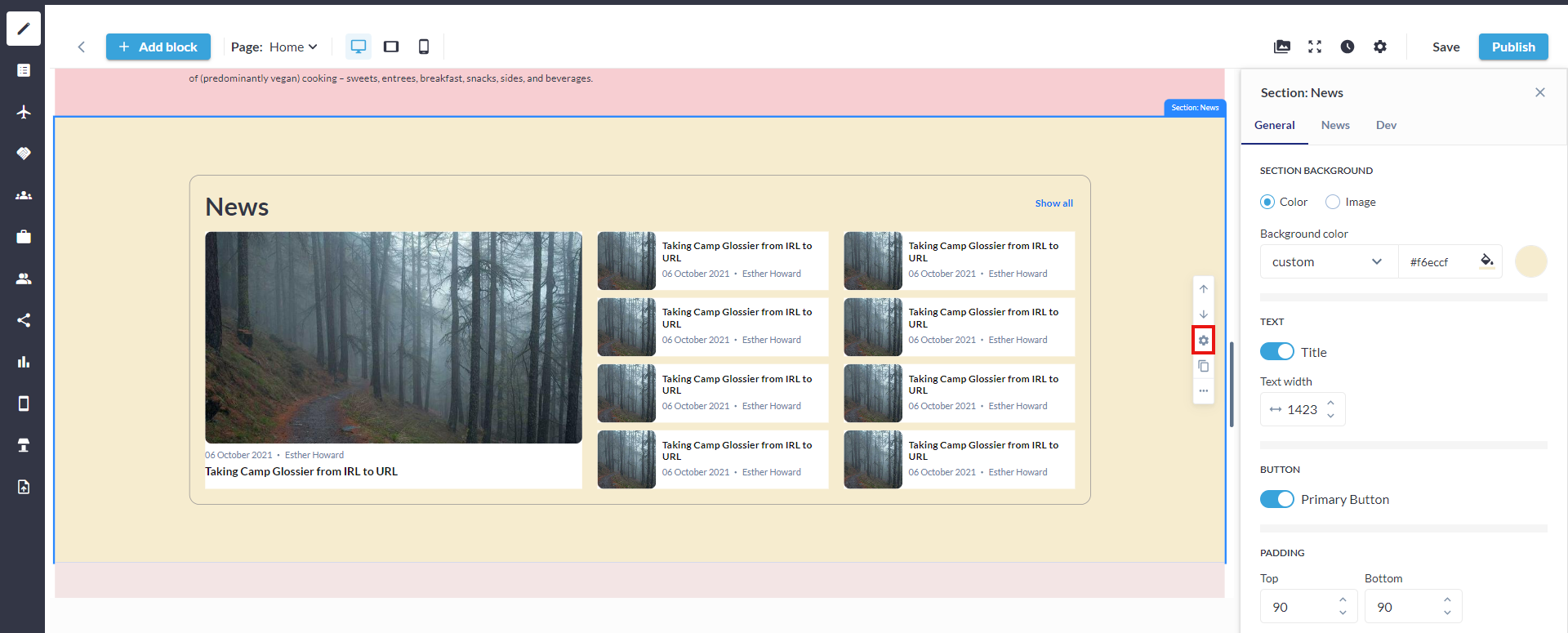 Settings: News Block 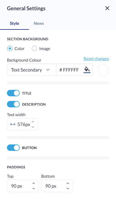 Style Settings: News Block
|
News Settings
Click on the settings icon of the News Block to manage the below settings Tag Selection: Choose specific news tags to be associated with the news articles displayed in the block. This allows organizers to categorize and organize news content based on themes or topics. Source Selection(News to Show): Select the source of news articles to be displayed, providing options such as showing news from all sources, only organizers, or specifically from exhibitors. This customization offers flexibility in tailoring the content to specific contributors. Product Category Selection: Specify product categories associated with the news articles to create thematic groupings. This allows users to focus on news related to specific product categories. Date Filter: Set a start date to determine the range of news articles to be displayed. This feature enables users to showcase recent news or highlight specific periods of interest. Custom News Selection: Choose specific news articles to be included in the block, providing users with a curated approach to content presentation. This selection could also involve searching for news associated with exhibitors for added flexibility. The default sorting for the News Block is "Latest News is shown on the Top." |
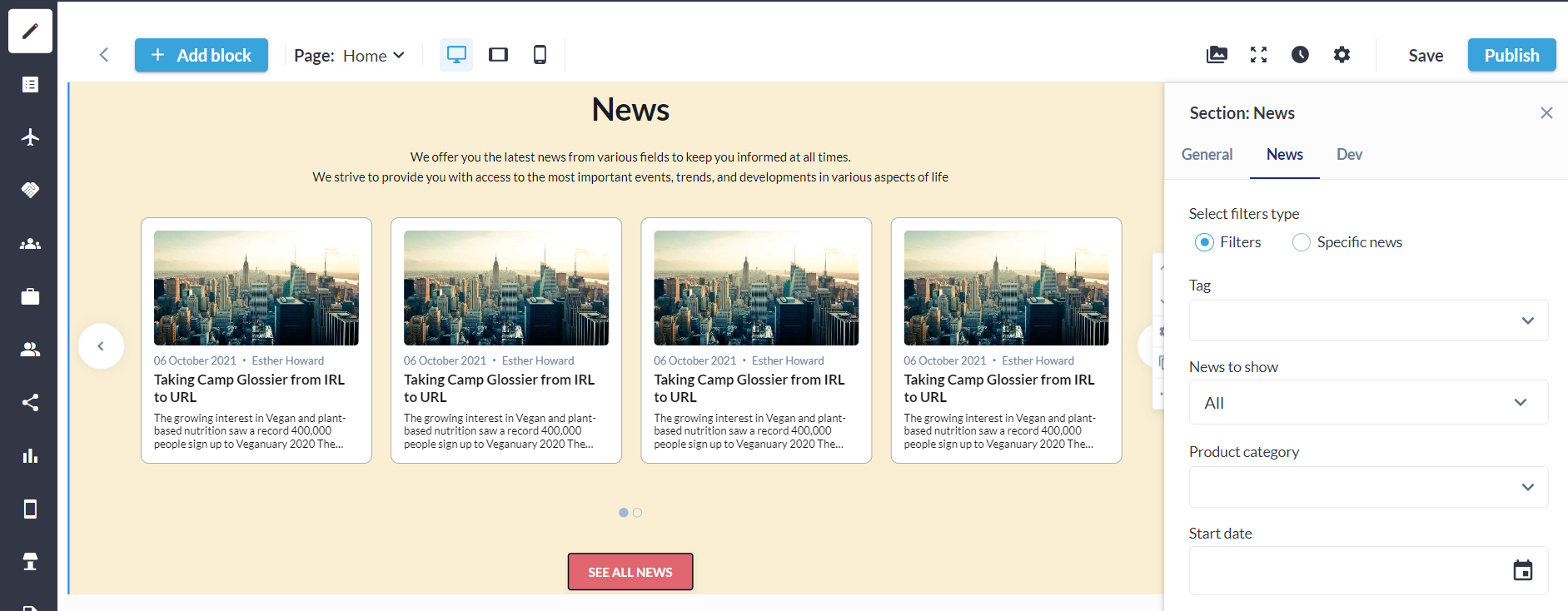 News Setting Block
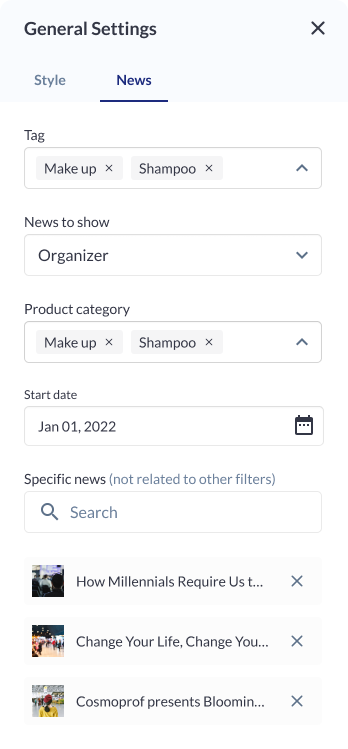 News Settings |
Button Settings
Button Type: Choose from various button types, such as standard, outlined, or textured, to match the desired visual style and design. Background Color: Customize the background color of the button to align with the overall color scheme or create a distinctive visual element. Size & Shape:
Border:
Shadow:
| 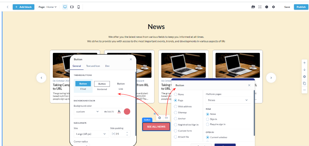 Button & its Link Settings : News Block
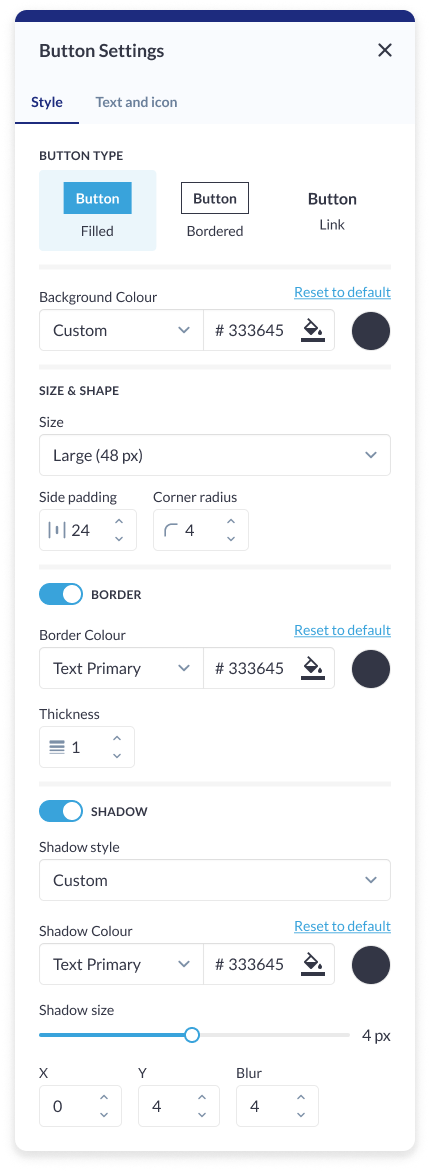 Button Setting: News Block |
Carousel Settings
Click on the settings icon of the Carousel Block to manage the below settings Type: Allows organizers to choose the type of carousel to be displayed, providing them with options for various carousel layouts or styles. Specify whether it's a traditional carousel, a multi-row carousel, or another visually appealing type. Total Number of Cards: Define the total number of cards to be displayed in the carousel, allowing organizers to control the quantity of content visible at a given time. Card Display: Blocks can be set as a slider or static block. Arrows Settings:
Pagination: Enable or disable pagination for a streamlined or detailed viewing experience. Autoplay Slideshow ON/OFF: Enable or disable automatic slideshow playback for a hands-free viewing experience. | 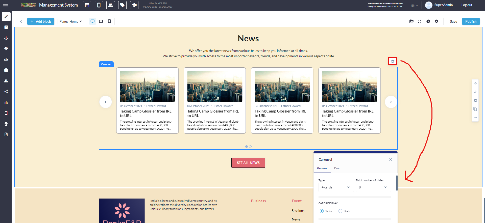 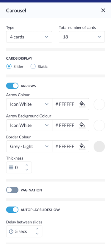 Carousel Settings
|
Card Settings
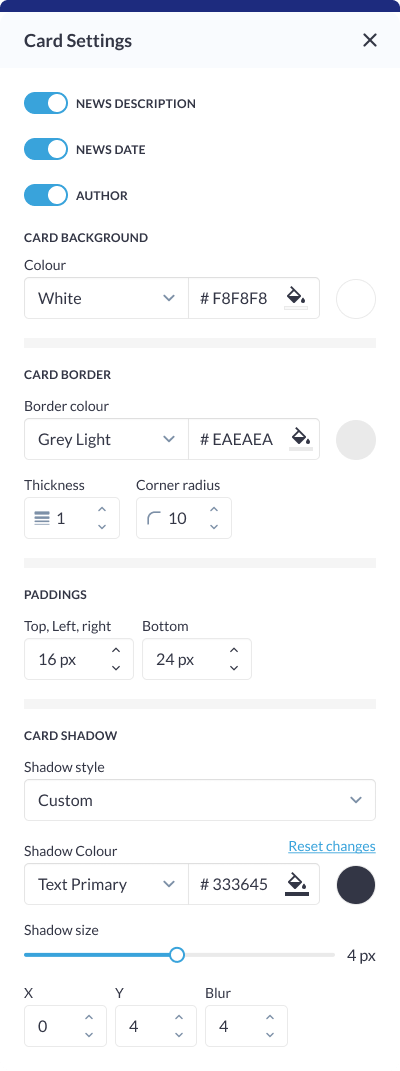
Click on the settings icon of the Card Block to manage the below settings News Description: Control the visibility and formatting of the news article description on the card, ensuring organizers to have the flexibility to present concise or detailed information. News Date Display: Determine how the news date is displayed on the card, allowing for various formats or styles. Author Display: Allows organizes to choose whether to display the author's name on the card, providing flexibility in presenting the contributor of the news article. Background Colour: Customize the background color of each card to match the overall theme or create visual contrast within the news block. Card Border:
Padding (Top, Left, Right, Bottom): Fine-tune the spacing around the card content to ensure optimal visual balance and alignment within the news block. Card Shadow:
|  Card Setting
 Card Settings: News Block |
Different layout have different elements that can be customised using element blocks
