Feature Purpose:
This feature allows administrators to configure different types of selection fields (Select, Checkbox Group, and Radio Group) for filtering, conditional display, and speed networking functionality on the frontend.
Working with this Feature:
Select
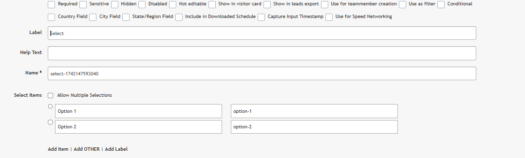
To learn more about the checkbox fields at the top (required, sensitive, hidden, etc.) please refer to Common Field Properties article.

|
Use as a filter |
This field will be used as a delegates filter on the frontend, when checked. |
|
Conditional |
When checked, “Country Field”, “City Field” and “State/Region Field” settings disappear. When checked, this field options will appear in “Visible to” block in settings pop-up of Grid (1 col), Grid (2 col) and Grid (3 col) elements, except the one that directly contains current “Select” field. |
|
Country Field |
When checked, this field on the frontend transforms into the City selection field. In settings pop-up select options settings and “Conditional” checkbox disappear. |
|
City Field |
When checked, this field on the frontend transforms into the City selection field. In settings pop-up select options settings and “Conditional” checkbox disappear, and “Country field” select setting appears: if left empty, then on the frontend Select field option will be taken according to the system field “State/Region”. |
|
State/Region Field |
When checked, this field on the frontend transforms into the City selection field. In settings pop-up select options settings and “Conditional” checkbox disappear, and “Country field” select setting appears: if left empty, then on the frontend Select field option will be taken according to the system field “Country”. |
|
Select items |
As this is a select-type field, this block contains settings of select items. |
|
Allow Multiple Selections |
Allows to select multiple items. When checked, select items change their type from radio to checkbox and on the frontend user can select multiple items. |
|
Select item |
When a group is checked or radio set to ON, then on frontend this item has to be preselected. Left input field is dedicated to item name and right - to item value. |
|
Add item |
Adds more select items. |
|
Add label |
Adds a label that can’t be selected. Can be used for separating different groups of items. |
|
Label Text |
Label text. |
|
Add OTHER |
Adds option “Other”, that also can be preselected and has item name and item value. Also, two more elements are added: “Required” checkbox and “Placeholder” field. 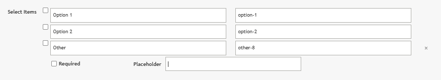

|
|
Placeholder |
Entered data will be displayed in an empty field of “Other” option as a placeholder. |
|
Country field * |
This field appears when the “City Field” or “State/Region Field” setting is on. Options of this select are other country selection fields. |
|
Option Name |
Unique field identifier. On the frontend, the entered value will be used in options attributes HTML attributes. |
|
Use for Speed Networking |
Fields with the checked “Use for Speed Networking“ checkbox are transmited to the Opt-in speed networking session settings page (step “Conditions“). |
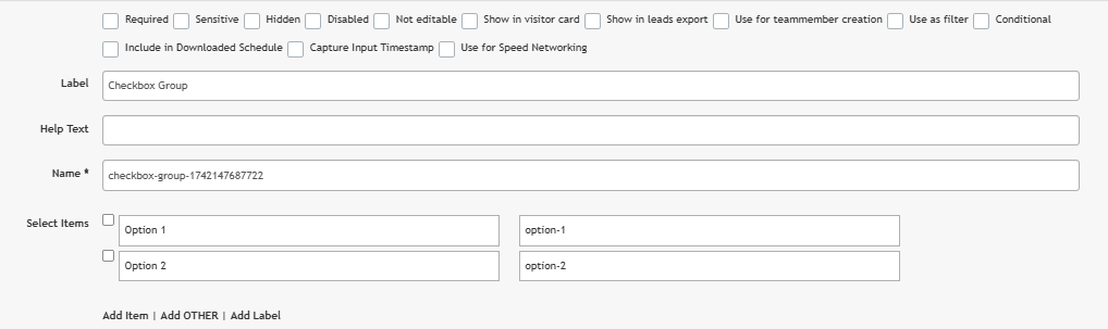
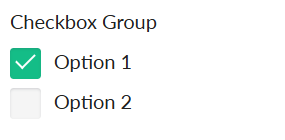
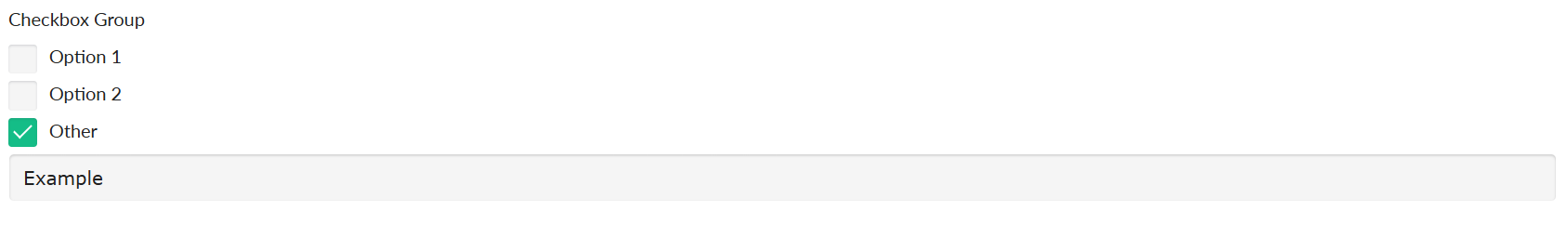
Checkbox Group
|
Use as filter |
This field will be used as a delegate filter on the frontend, when checked. |
|
Conditional |
When checked, this field options will appear in “Visible to” block in settings pop-up of Grid (1 col), Grid (2 col) and Grid (3 col) elements, except the one that directly contains current “Radio Group” field. |
|
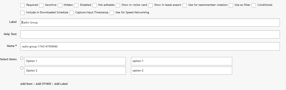
Name * |
Unique field identifier. On the frontend, the entered value will be used in “name” and “id” HTML attributes. |
|
Select items |
This block contains settings of checkbox items. |
|
Checkbox item |
When the checkbox is checked, then on frontend this item has to be preselected. Left input field is dedicated to item name and right - to item value. |
|
Add item |
Adds more checkbox items. |
|
Add label |
Adds a label that can’t be selected. Can be used for separating different groups of items. |
|
Label Text |
Label text. |
|
Add OTHER |
Adds option “Other”, that also can be preselected and has item name and item value. Also, two more elements are added: “Required” checkbox and “Placeholder” field. 
|
|
Required |
When checked, the user must fill in the “Other” option. |
|
Placeholder |
Entered data will be displayed in an empty field of “Other” option as a placeholder. |
|
Use for Speed Networking |
Fields with the checked “Use for Speed Networking“ checkbox are transmited to the Opt-in speed networking session settings page (step “Conditions“). |
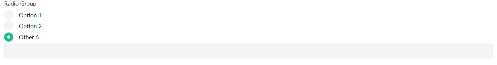
Radio group

|
Use as filter |
This field will be used as a delegate filter on the frontend, when checked. |
|
Conditional |
When checked, this field options will appear in “Visible to” block in settings pop-up of Grid (1 col), Grid (2 col) and Grid (3 col) elements, except the one that directly contains current “Radio Group” field. |
|
Name * |
Unique field identifier. On the frontend, the entered value will be used in “name” and “id” HTML attributes. |
|
Select items |
This block contains settings of radio items. |
|
Radio item |
When a radio is set to ON, then on frontend this item has to be preselected. Left input field is dedicated to item name and right - to item value. |
|
Add item |
Adds more radio group items. |
|
Add label |
Adds a label that can’t be selected. Can be used for separating different groups of items. |
|
Label Text |
Label text. |
|
Add OTHER |
Adds option “Other”, that also can be preselected and has item name and item value. Also, two more elements are added: “Required” checkbox and “Placeholder” field. 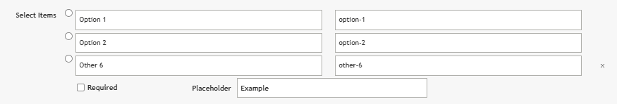
|
|
Required |
When checked, the user must fill in the “Other” option. |
|
Placeholder |
Entered data will be displayed in an empty field of “Other” option as a placeholder. |
|
Use for Speed Networking |
Fields with the checked “Use for Speed Networking“ checkbox are transmited to the Opt-in speed networking session settings page (step “Conditions“). |