Feature Purpose:
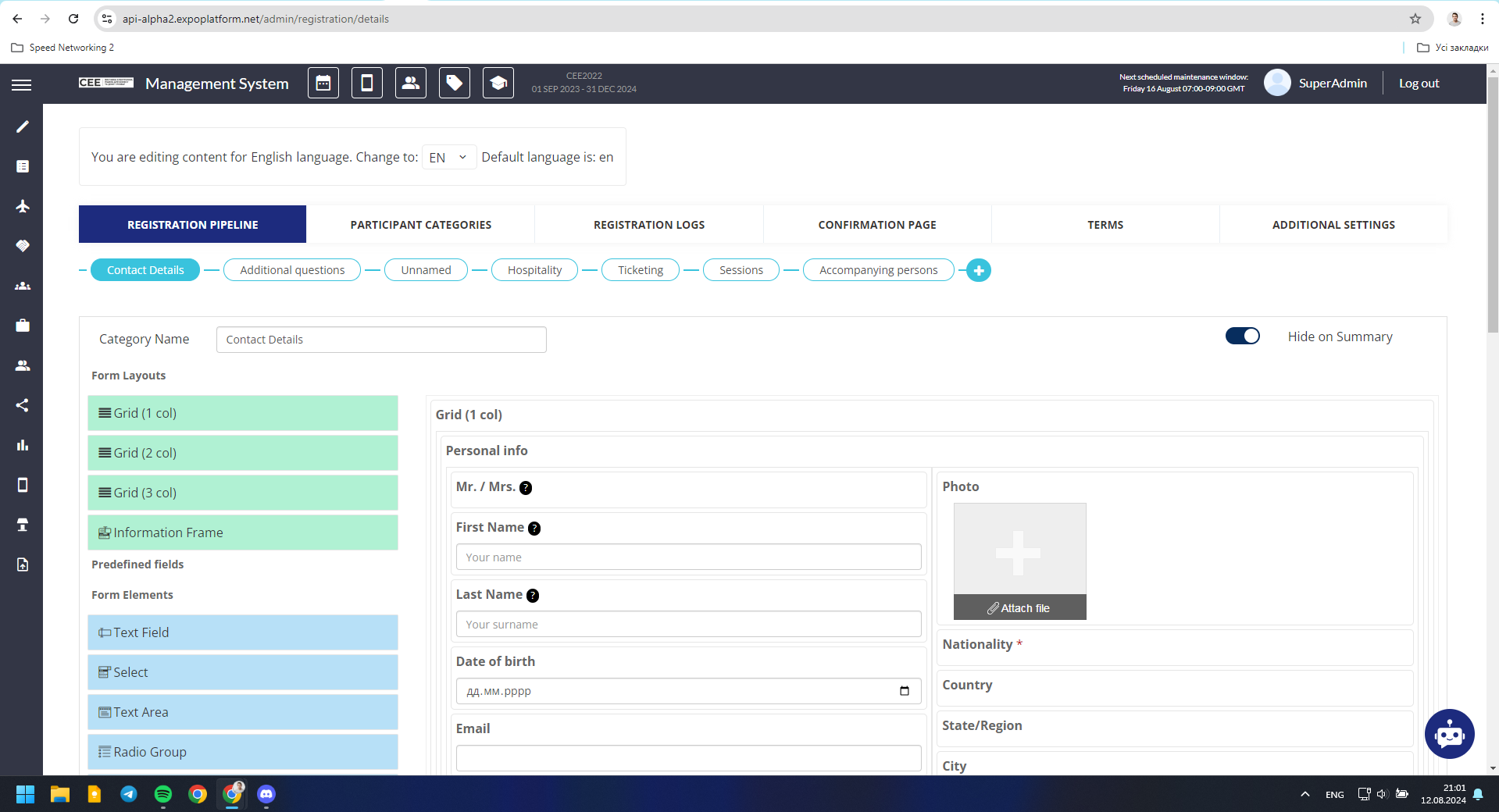
The Form Builder allows you to create forms with different layouts and settings. The Form Layouts block contains markup elements. Each element can be placed inside of others multiple times.
Working with this Feature:
Layouts:
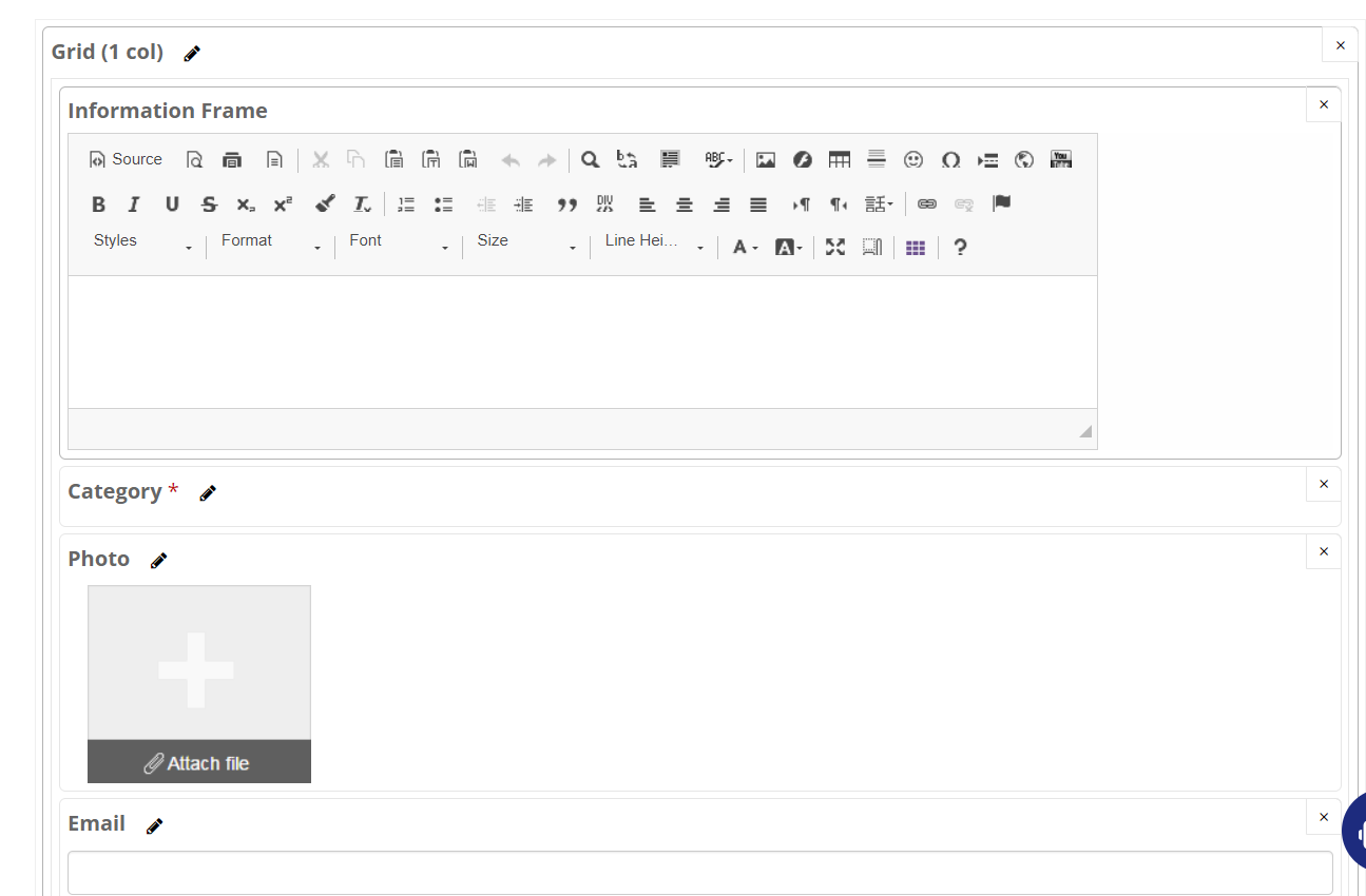
Grid (1 column)
This element provides one-column markup. Elements inside of this block will be stretched to the full width of the column.
|
Setting name |
Field type |
Action, properties |
|
Dropdown |
Checkbox |
Old functionality, please do not use |
|
Show label |
Checkbox |
Displays data from field “Label” on the frontend, in the top of the fields group. |
|
Label |
Input |
Fields group name. Can be displayed on the frontend when the “Show label” checkbox is checked. |
|
Visible to |
Checkbox group |
Each checkbox in the group relates to the participant category. Visible to all when all checkboxes are unchecked. Field group will be visible only to participants of checked categories. This setting set at parent grid-element has higher priority than analogical grid-elements at child grid-elements. |
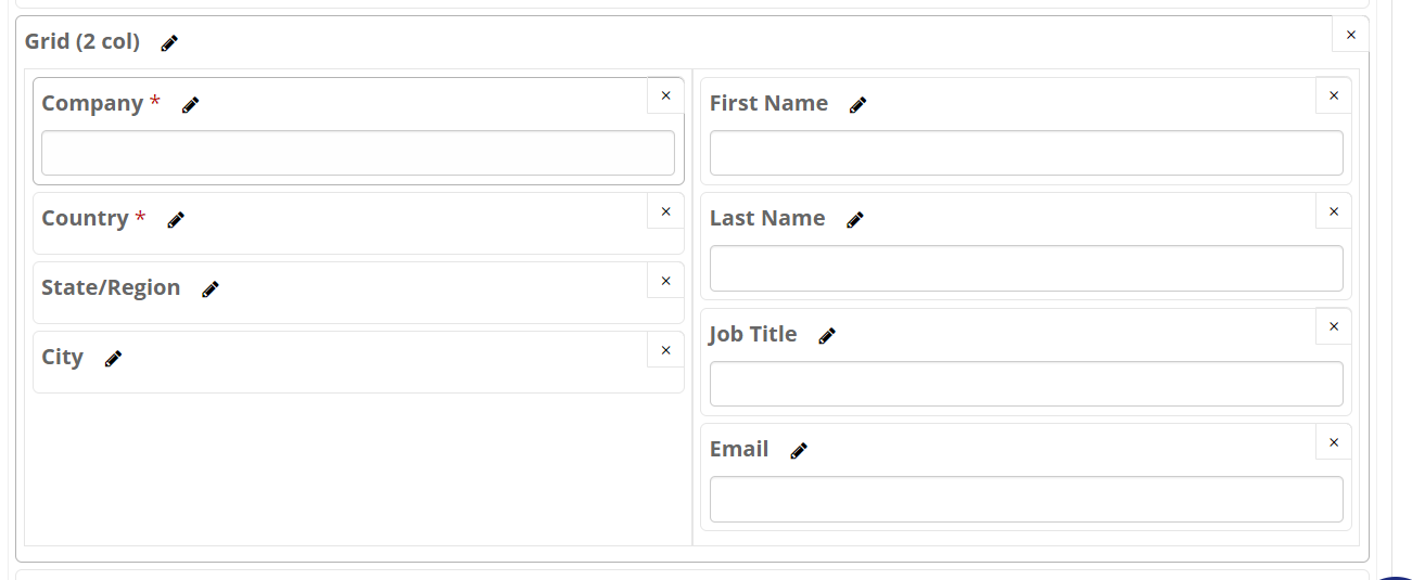
Grid (2 columns)
This element provides two-column markup. Elements inside of each column will be stretched to the full width of the column.
|
Setting name |
Field type |
Action, properties |
|
Dropdown |
Checkbox |
Old functionality, please do not use |
|
Show label |
Checkbox |
Displays data from field “Label” on the frontend, in the top of the fields group. |
|
Label |
Input |
Fields group name. Can be displayed on the frontend when the “Show label” checkbox is checked. |
|
Visible to |
Checkbox group |
Each checkbox in the group relates to the participant category. Visible to all when all checkboxes are unchecked. Field group will be visible only to participants of checked categories. This setting set at parent grid-element has higher priority than analogical grid-elements at child grid-elements. |
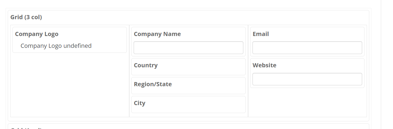
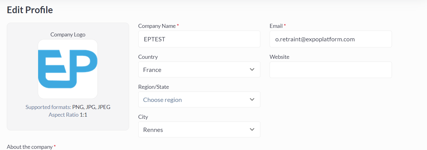
Grid (3 columns)
This element provides three-column markup. Elements inside of each column will be stretched to the full width of the column.
|
Setting name |
Field type |
Action, properties |
|
Dropdown |
Checkbox |
Old functionality, please do not use |
|
Show label |
Checkbox |
Displays data from field “Label” on the frontend, in the top of the fields group. |
|
Label |
Input |
Fields group name. Can be displayed on the frontend when the “Show label” checkbox is checked. |
|
Visible to |
Checkbox group |
Each checkbox in the group relates to the participant category. Visible to all when all checkboxes are unchecked. Field group will be visible only to participants of checked categories. This setting set at parent grid-element has higher priority than analogical grid-elements at child grid-elements. |
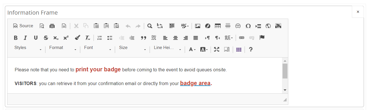
Information Frame:
This block is a WYSIWYG text editor. Usually is used for adding a text message to the form.
Fields:
Adding Standard Fields
-
You can find more info about standard fields here
-
To add a standard field just drag that field from the left sidebar to the workzone.
-
Each standard field can be used in the form only once.
-
Standard fields can be used on any tab of the form in the Form Builder
Adding custom fields
-
You can find more info about custom fields here
-
To add a custom field just drag that field from the left sidebar to the workzone..
-
Each custom field can be used in the form multiple times.
-
Custom fields can be used on any tab of the form in the Form Builder
Edit / Delete Fields
-
A field can be edited when it is in the workzone. To edit, click the Pencil icon, that appears when your cursor is in the workzone. Details about edit properties are in this section.
-
To delete a field need to click the Cross icon, that appears when your cursor is in the workzone.
-
Fields and layout elements can be dragged within one tab.
Managing tabs:
-
Tabs can be ordered in the way you need
-
Contact details is a default tab and can be renamed
-
Additional tabs can be created using the “+“ button.
-
The “Hide on Summary“ toggle will hide the block of information from the respective section on the registration “Summary” step.
-
Custom sections can be disabled, which means that they won’t be shown during registration or in the user’s Edit Profile section
-
The “Hide on Registration“ toggle will remove the section from the registration form, but will leave it in the user’s Edit Profile section
-
The “Hide on Edit profile“ toggle will remove the section from the user’s Edit Profile section, but will leave it in the registration form.
-
The “Delete section“ button is available for the custom tabs only. This button deletes the section instantly without a warning