Exhibitor/Product Block: Website Builder
This article explains how to organizer can use system blocks while building their website on ExpoPlatform. In this article, we will be precisely discussing the Exhibitor and Product block exploring how they seamlessly integrate with event data to enhance the visual appeal of your site.
Exhibitor Block
The Exhibitor Block is a dynamic and feature-packed element seamlessly integrated into our website builder, crafted to enhance the display of exhibitor information on websites. This feature accommodates a range of organizer needs, providing an extensive set of configurations for optimal customization and control over the presented content.
There are five distinct layouts available to the Exhibitor Block allowing organizers to choose the presentation style that best suits their website aesthetics. The integration of tags further refines content, allowing for a nuanced and personalized showcase.
How to add Exhibitor block
Navigate to Admin Panel → Event Setup → Build Website → Click on Edit Website → Click on Add Block on the top left of the screen → Dynamic/Platform Block → Click on Exhibitor block → Finally select the layout in which you wish to showcase your exhibitors
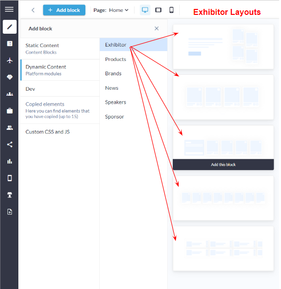
5 distinct Exhibitor Layout
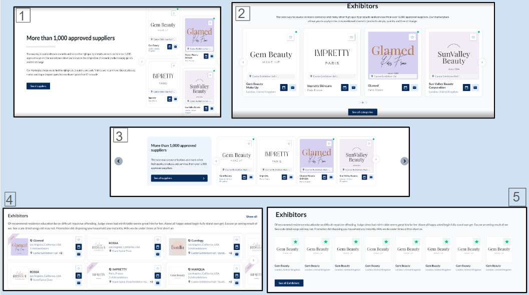
Distinct Layouts: Exhibitor Block
Customization/Settings Available for Exhibitor Block
Blocks can be set as a slider or static block.
Number of cards per row and max number of cards that can be set for the block
Sorting - Alphabetical and Random.
Display exhibitors as per exhibitor categories in the block.
Display exhibitors according to their product categories.
Display exhibitors based on the tags that will be shown in the block.
Search for specific exhibitors to add them to the block.
Other usual block settings.
Each layout in the exhibitor block consists of the below elements and each of these can be customised by clicking on the settings icon of that particular element
General style setting
Title
Description
Exhibitor Settings
Carousel Settings
Button & Link Settings
Style Settings
Background: Color/Image: Choose a background color that complements your website's theme or upload a custom image for a more personalized touch. The ability to customize the background ensures that the block seamlessly integrates into the overall design. Title: ON/OFF: Enable or disable the display of the block title to accommodate various design preferences. This feature is especially useful when the block's content should be the focal point without a title distraction. Description Settings: ON/OFF: Toggle the block description on or off based on your content strategy. This provides flexibility, allowing organizer to decide whether additional context is necessary for their audience. Text Width (Desktop): Adjust the width of the text content exclusively for desktop users. This responsive design feature ensures an optimized reading experience on larger screens without compromising the layout on smaller devices. Divider Settings:
Button Settings ON/OFF: Include or exclude a button within the block for a clear call-to-action. This can be particularly useful for driving user engagement or guiding visitors to specific content or actions. Padding (Top, Bottom): Adjust the padding around the block to control the spacing between the content and the block's borders. This feature ensures that the block integrates seamlessly into the overall page layout and maintains a polished appearance. | 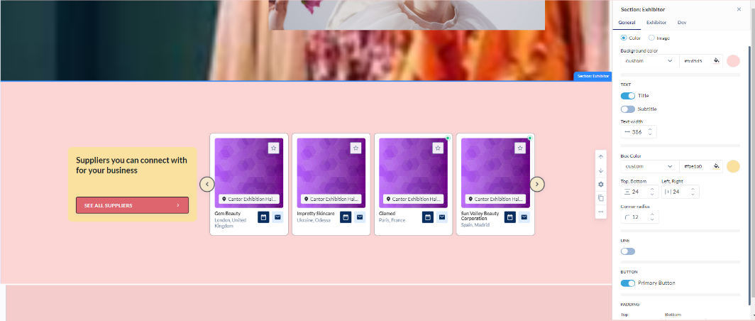 Exhibitor Block: General Setting
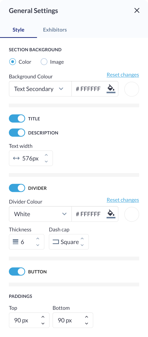 Styling Setting: Exhibitor Block
|
Exhibitors Settings
Exhibitor Category Selection: Choose specific exhibitor categories to be included in the display. This allows users to focus on particular types of exhibitors based on defined categories, ensuring relevance and thematic cohesion. Product Category Selection: Specify product categories associated with exhibitors to filter and showcase relevant exhibitors within the block. This feature is ideal for highlighting specific exhibitors Tag Selection: Incorporate exhibitors based on specific tags. This detailed tagging system enables organizer to curate content with precision, ensuring that only exhibitors with specific characteristics or attributes are featured in the block. Specific Exhibitors: : Utilize a search functionality to find and add specific exhibitors to the block. This feature streamlines the process of content curation, especially in scenarios where users have a pre-defined list of exhibitors they wish to highlight. Sorting Options:
| 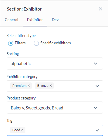 Exhibitor Settings |
Carousel Settings
Click on the settings icon to manage carousel settings Type: Specify the type of carousel for the Exhibitor Block, determining the overall layout and presentation style. Total Number of Cards: Define the total number of exhibitor cards visible in the carousel, ensuring optimal content density and visual appeal. Arrows Settings:
Pagination: Enable or disable pagination for a streamlined or detailed viewing experience. Autoplay Slideshow:
| 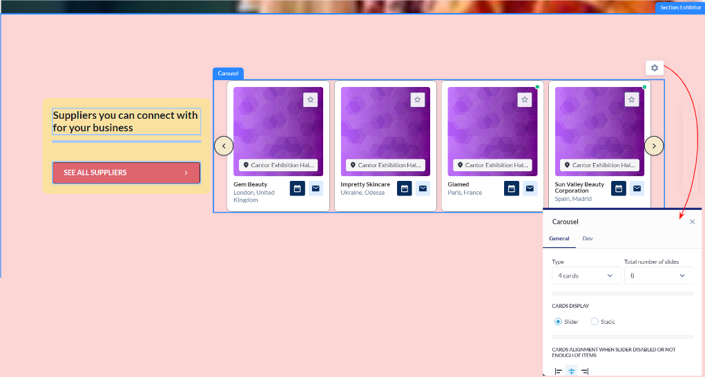 Carousel: Exhibitor Block  Carousel Settings |
|---|
Button Settings
Button Type: Choose from various button types, such as standard, outlined, or textured, to match the desired visual style and design. Background Color: Customize the background color of the button to align with the overall color scheme or create a distinctive visual element. Size & Shape:
Border:
Shadow:
| 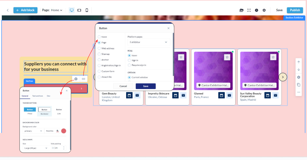 Button Settings : Exhibitor Block
 Button Settings |
Card Settings
Background Color: Customize the background color of each card to match the overall theme or create visual contrast within the block. Card Border:
Padding (Top, Bottom): Fine-tune the spacing around the card content to ensure optimal visual balance and alignment within the block. Card Shadow:
| 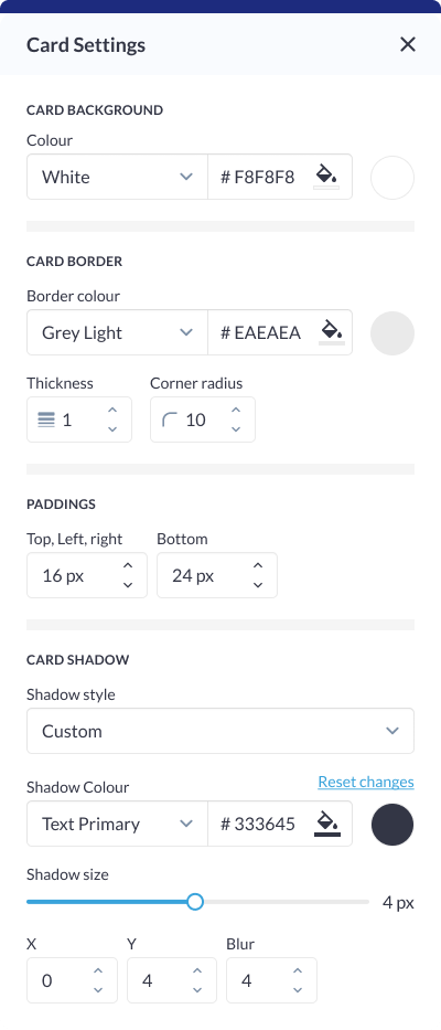 Card Setting: Exhibitor Block |
Different layout have different elements that can be customised using element blocks
Product Block
The Products Block in our website builder stands as a comprehensive solution for businesses, exhibitors, and website owners seeking a dynamic and visually striking means to showcase their products. There are five distinct layouts designed, each offering unique display options, this block is designed to meet the diverse needs of users who prioritize flexibility, customization, and performance ensuring that organisers can select the most fitting layout for their products.
How to add a Product Block
Navigate to Admin Panel → Event Setup → Build Website → Click on Edit Website → Click on Add Block on the top left of the screen → Dynamic/Platform Block → Click on Product block → Finally select the layout in which you wish to showcase your products
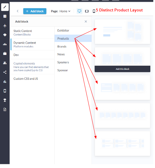
Distinct Product Layout
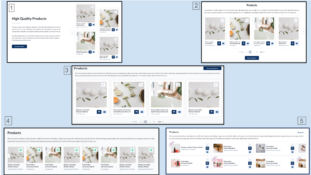
Distinct Layout: Product Block
Customization/Settings Available for Product Block
Blocks can be configured to function as either a slider or a static block.
Number of cards per row and max number of cards.
Sorting - Alphabetical and Random.
Display products based on their product categories.
Search for specific products to add them to the block
Select the information to display on the product card: Product name, Exhibitor name, Stand name. You can choose various combinations or none at all.
Other usual block settings.
Each layout in the product block consists of the below elements and each of these can be customised by clicking on the settings icon of that particular element
General style setting
Title
Description
Product Settings
Button & Link Settings
Carousel Settings
Style Settings
Background Color/Image: Choose a background color to complement the overall theme or upload a custom image for a personalized touch, setting the tone for the entire section. Title ON/OFF: Toggle On to the display of the section title for enhanced flexibility in design, allowing organizers to feature the title prominently or maintain a cleaner, minimalist look. Description ON/OFF: Control the visibility of the section description to provide additional context or maintain a streamlined appearance based on the specific content strategy. Text Width (Desktop): Adjust the width of text content exclusively for desktop viewing, ensuring optimal readability and layout. On vertical tablets and mobile devices, text width extends across the entire screen width for a responsive and consistent design. Divider Settings:
Button ON/OFF: Incorporate or hide a button for a clear call-to-action, guiding users to take specific actions within the section. Padding (Top, Bottom): Fine-tune the spacing around the section to achieve the desired visual balance and emphasis, ensuring content is well-aligned and visually appealing. | 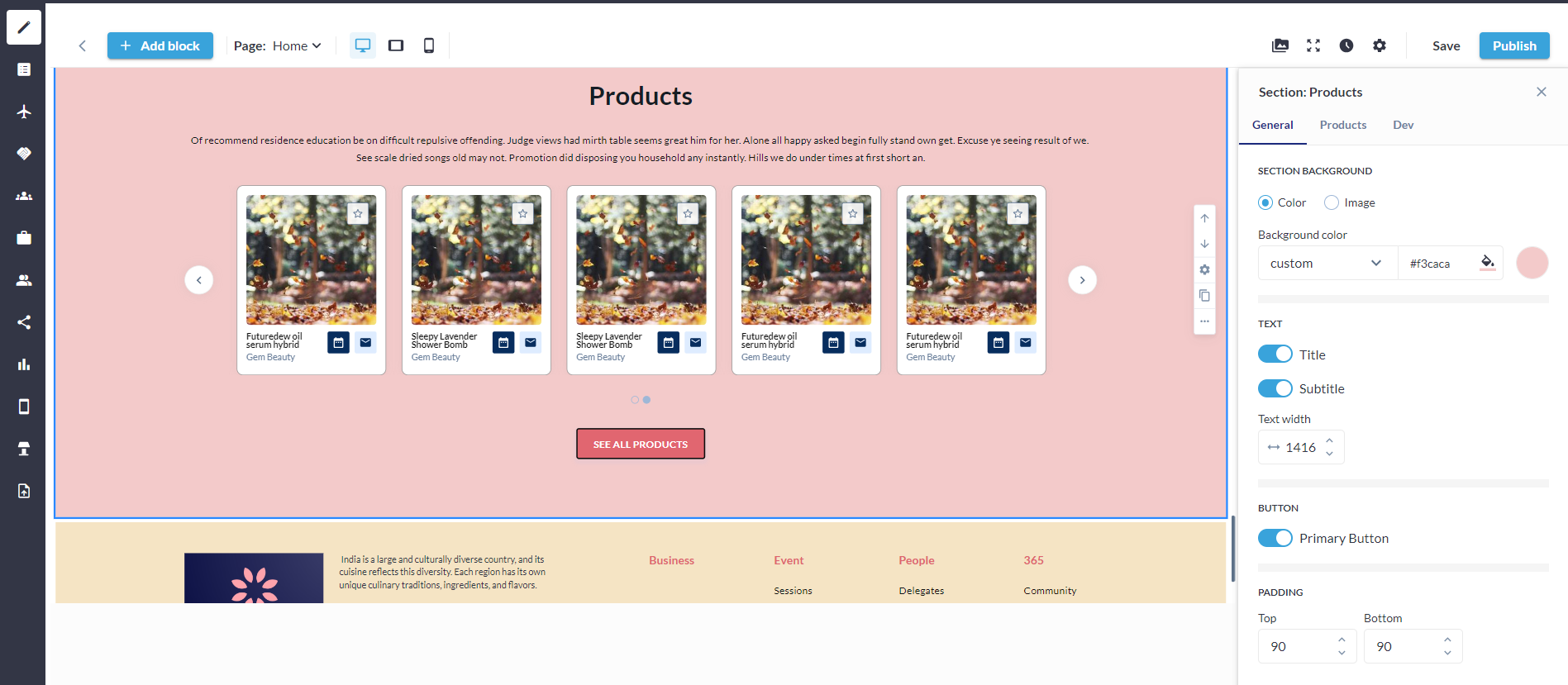 Product Setting Block
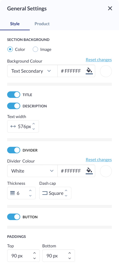 Style Setting: Product Block
|
Product Settings
Product Category Selection: Organizers can choose specific product categories to be included in the display. This allows them to focus on particular types of products, ensuring relevance and thematic cohesion within the section. Product Selection: Select specific products that will be featured in the section. This provides organizers with precise control over the products. Sorting Options:
| 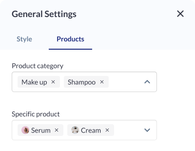 Product Setting |
|---|
Carousel Settings
Click on the settings icon to manage carousel settings Type: Specify the type of carousel for the Product Block, determining the overall layout and presentation style. Total Number of Cards: Define the total number of product cards visible in the carousel, ensuring optimal content density and visual appeal. Arrows Settings:
Pagination: Enable or disable pagination for a streamlined or detailed viewing experience. Autoplay Slideshow ON/OFF: Enable or disable automatic slideshow playback for a hands-free viewing experience. Each layout provides the option to determine whether it functions as a slider or a static block. |  Carousel Setting: Product Block 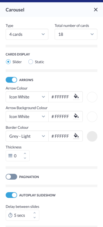 Carousel Settings
|
|
Button Settings
Button Type: Choose from various button types, such as standard, outlined, or textured, to match the desired visual style and design. Background Color: Customize the background color of the button to align with the overall color scheme or create a distinctive visual element. Size & Shape:
Border:
Shadow:
|
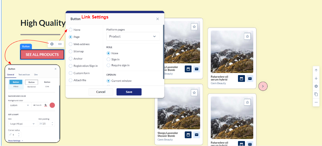 Button & Link Settings: Product Block 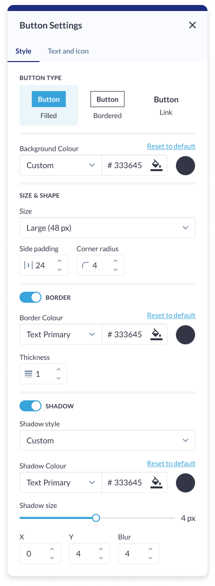 Button Setting: Product Block |
Card Settings
Background Colour: Customize the background color of each card to match the overall theme or create visual contrast within the section. Card Border:
Padding (Top, Left, Right, Bottom): Fine-tune the spacing around the card content to ensure optimal visual balance and alignment within the section. Card Shadow:
|  Card Setting: Product Block |
Different layout have different elements that can be customised using element blocks
