Content Block: Website Builder
A content block within a website builder is a segment that can be inserted into a webpage to showcase specific types of content. Website builders have a block-based approach to design, enabling the users to add, rearrange, and personalize these content blocks to establish the layout of the web pages.
These blocks encompass various elements like text, images, videos, forms, buttons, and more. Organizers have the flexibility to drag and drop these blocks onto the webpage, adjusting their placement and appearance to craft a visually appealing and functional website.
ExpoPlatform has various content blocks in different layouts that can be added to the web pages of the event website.
To add a content block Navigate to Admin Panel → Event Setup → Build Website → Click on Edit Website → Click on Add Block on the top left of the screen → Static/Content Block → Click on the block type → Finally select the layout in which you wish to showcase the details of your content
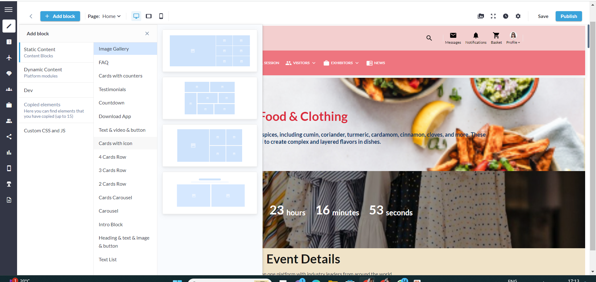
Each block and its element can be individually customized by clicking on the setting icon for that vary element.
Suppose the organizer selects to add the Intro Block to the website, each element of this block can be customised by clicking on the settings button of that element. To manage the general setting of Intro Block, Click on the settings button on the extreme right of the screen
General Settings
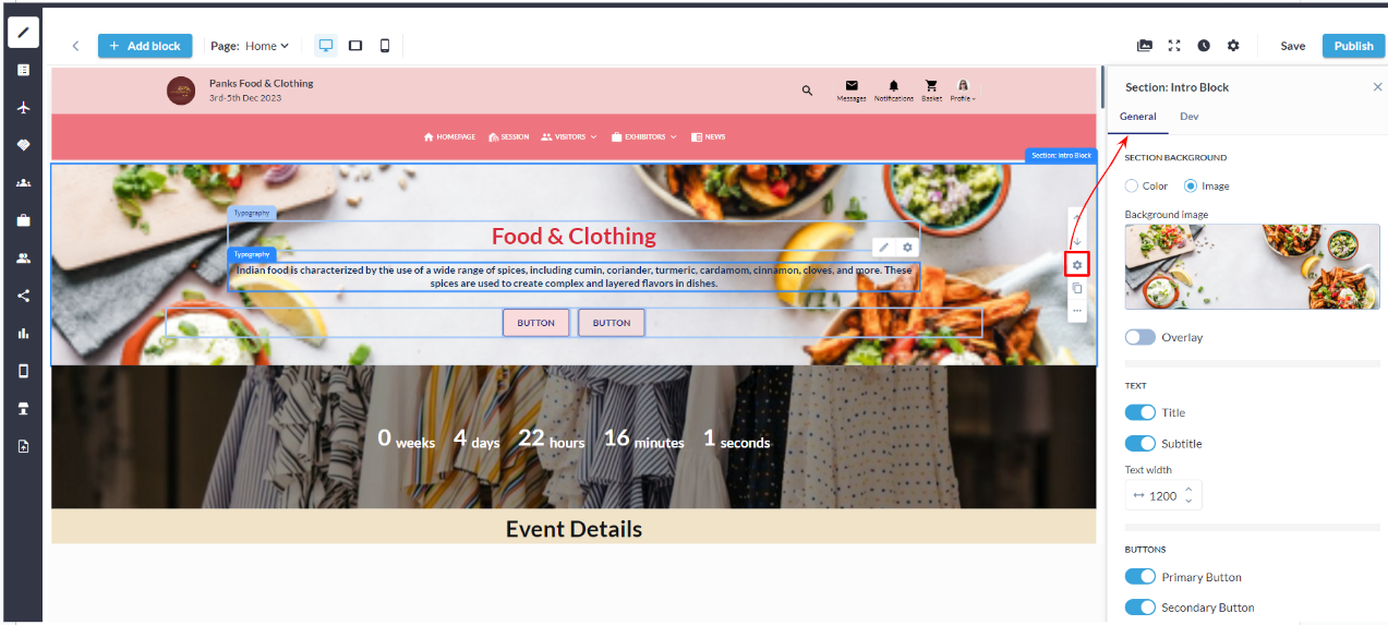
General Setting: Intro Block
Section Background: Through this setting, the organizer can incorporate an image or background colour into the block to align with the overall theme of the website.
Overlay: It is a semi-transparent graphic element that the organizer can position on top of an existing image to make the text (heading and subheading) clear
Text(Title & Description): Organizer can enable or disable the display of the block title and description to accommodate various design preferences. This feature is especially useful when the block's content should be the focal point without a title distraction.
Buttons: The Organizer can enable or disable the primary and secondary buttons for the block based on the event website requirement. Click on the button settings icon to manage the settings below
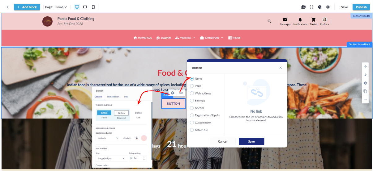
Button Settings
4.1 Button Type: Choose from various button types, such as standard, outlined, or textured, to match the desired visual style and design.
4.2 Background Color: Customize the background color of the button to align with the overall color scheme or create a distinctive visual element.
4.3 Size & Shape:
Size: Adjust the overall size of the button to suit the design and layout preferences.
Side Padding: Set the padding on the sides of the button for precise control over spacing and alignment.
Corner Radius: Define the corner radius to achieve rounded or squared corners, adding a touch of sophistication or modernity to the button's appearance.
4.4 Button Border
Border Color: Specify the color of the border for enhanced visual contrast or seamless integration with the background.
Thickness: Adjust the thickness of the button border to control the prominence and emphasis of the button within the block.
4.5 Shadow:
Shadow Style: Choose a shadow style for the button, such as flat, raised, or inset, to add depth and dimension.
Shadow Color: Customize the color of the shadow to complement the overall design and create a cohesive visual effect.
Shadow Size: Adjust the size of the shadow to control the intensity and prominence, providing a subtle or more pronounced shadow effect.
Padding (Top, Bottom): Adjust the padding around the block to control the spacing between the content and the block's borders. This feature ensures that the block integrates seamlessly into the overall page layout and maintains a polished appearance.
Title & Description
Clicking the settings button for the Title and Description enables the organizer to oversee Typography settings, encompassing the management of text colour, text style, font type, font weight, font size, and more.
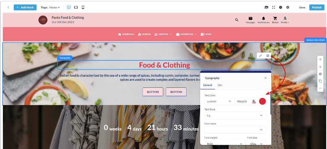
Title and Description Settings
By utilizing the settings located on the extreme right of the block, the organizer can oversee and manage the following configurations for the block.
Upward/Downward Arrow: Use to reposition the block/section by moving it upward or downward on the website.
Settings: Opens the General Styling tab for that block.
Duplicate: The Organizer can create a copy or replicate the block.
More Actions: Organizer can disable or delete the block from the More Actions button.
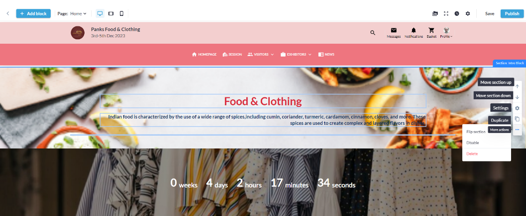
Managing Content Block Settings
Likewise, all Content blocks can be crafted to align with the overall theme of the website, enhancing their visual appeal and aesthetic.
