Skip table of contents

Brand Block: Website Builder

The Brand Block in the website builder is a pivotal feature, empowering organizers to craft a versatile range of brand experiences on their websites. Much like the Exhibitor and Product blocks, the Brand Block also offers four distinct layouts, each with varied displays based on their individual settings.

How to add Brand Block

Navigate to Admin Panel → Event Setup → Build Website → Click on Edit Website → Click on Add Block on the top left of the screen → Dynamic/Platform Block → Click on Brand block → Finally select the layout in which you wish to display your event brands
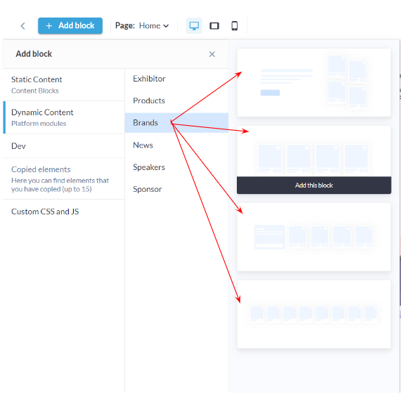
Brand Block: Admin Panel
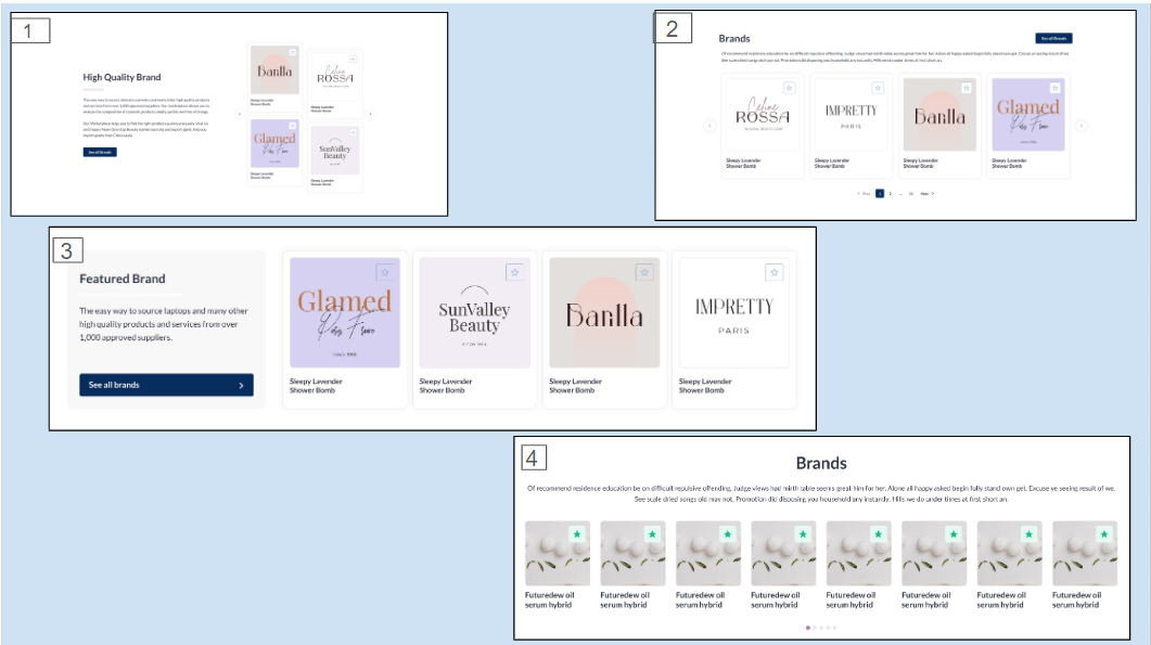
Brand Layout: Frontend

Customization/Settings Available for Brand Block

  1. Blocks can be set as a slider or static block.

  2. Manage number of cards per row and the maximum number of card

  3. Sorting by Last Name - A-Z, Z-A, Random

  4. Include brands based on product categories.

  5. Search for a particular brand to include in the block display

  6. Other usual block settings.

Each layout in the brand block consists of the below elements and each of these can be customised by clicking on the settings icon of that particular element

  • General style setting

    • Title

    • Description

  • Brand Settings

  • Carousel Settings

  • Button and Link Settings

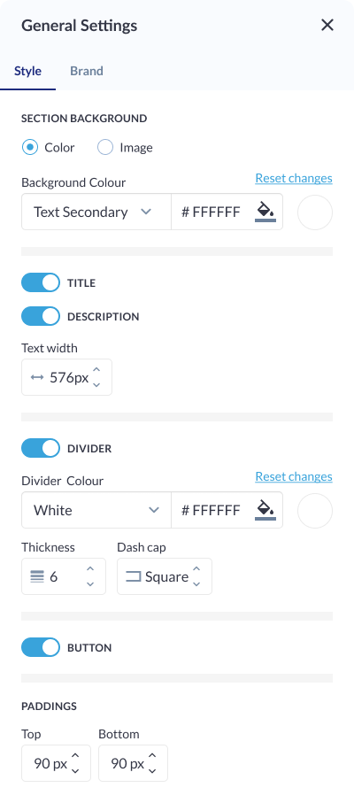
Style Setting

Background: Color/ Image: Customize the background with a choice of colors or upload an image to create a visually appealing backdrop for your content.

Title and Description:

  • Title ON/OFF: Toggle the visibility of the title for a cleaner or more minimalist look.

  • Description ON/OFF: Choose whether to display additional descriptive text along with the title.

Text Width:

  • Desktop: Adjust the width of the text content for desktop views, ensuring optimal readability and design.

  • Vertical Tablet and Mobile: Automatically spans the entire width to enhance responsiveness and adaptability.

Divider:

  • ON/OFF: Include or exclude dividers for a structured or seamless appearance.

  • Divider Color: Customize the color of the divider to complement your overall design scheme.

  • Thickness: Control the thickness of the divider, allowing for subtle or bold separations.

  • Dash Cap: Choose from different dash cap styles to add a touch of sophistication to the dividers.

Button: ON/OFF: Incorporate or hide buttons for a clear call-to-action or a streamlined aesthetic.

Padding: Fine-tune the spacing above and below the content block, providing control over the visual balance and spacing within the layout.

Style Settings

Brand Settings

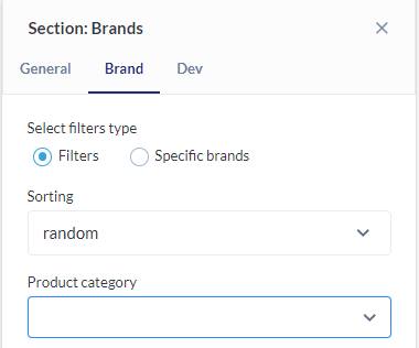
Select Product Category: Align brands with relevant product categories, allowing users to showcase brands based on the types of products or services they offer. This enhances user experience by presenting content in a targeted and contextually relevant manner.

Specific Brands: Provide users with the option to specifically select and showcase individual brands. This allows for a more curated and personalized presentation.

Sorting:

  • A-Z and Z-A: Arrange carousel cards in alphabetical order, promoting a structured and organized presentation.

  • Random: Shuffle the order of carousel cards randomly, injecting an element of surprise and variety into the user experience.

Brand Settings

Button Settings

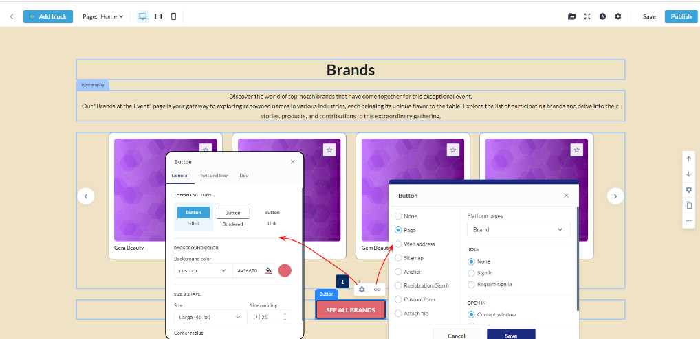
Button Type: Choose from various button types, such as standard, outlined, or textured, to match the desired visual style and design.

Background Color: Customize the background color of the button to align with the overall color scheme or create a distinctive visual element.

Size & Shape:

  • Size: Adjust the overall size of the button to suit the design and layout preferences.

  • Side Padding: Set the padding on the sides of the button for precise control over spacing and alignment.

  • Corner Radius: Define the corner radius to achieve rounded or squared corners, adding a touch of sophistication or modernity to the button's appearance.

Border:

  • Border Color: Specify the color of the border for enhanced visual contrast or seamless integration with the background.

  • Thickness: Adjust the thickness of the button border to control the prominence and emphasis of the button within the block.

Shadow:

  • Shadow Style: Choose a shadow style for the button, such as flat, raised, or inset, to add depth and dimension.

  • Shadow Color: Customize the color of the shadow to complement the overall design and create a cohesive visual effect.

  • Shadow Size: Adjust the size of the shadow to control the intensity and prominence, providing a subtle or more pronounced shadow effect.


Button and Link Settings: Brand Block
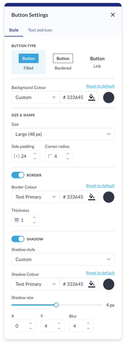
 

Button Setting: Brand Block

Carousel Settings

Click on the settings icon to manage carousel settings

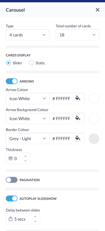
Type: Specify the type of carousel for the Brand Block, determining the overall layout and presentation style.

Total Number of Cards: Define the total number of bard cards visible in the carousel, ensuring optimal content density and visual appeal.

Arrows:

  • Arrow Colour: Customize the color of navigation arrows for a harmonious blend with the overall design.

  • Arrow Background Colour: Set the background color behind the navigation arrows to enhance visibility and aesthetics.

  • Border Colour: Define the color of the border surrounding the arrows, adding a refined touch to the navigation elements.

  • Thickness: Adjust the thickness of the arrow border to achieve the desired level of prominence.

Pagination: Enable or disable pagination for a streamlined or detailed viewing experience.

Autoplay Slideshow:

  • Autoplay Slideshow ON/OFF: Enable or disable the autoplay feature, allowing the carousel to automatically transition between cards.

  • Delay Between Slides: Specify the time interval between each slide transition, providing control over the slideshow speed and pacing.

Carousel Settings

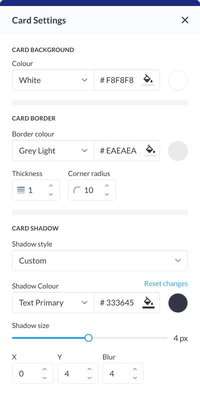
Card Settings

Card Background: Choose a color or upload an image to set the background for each card, providing a distinct visual identity for individual elements.

Card Border:

  • Border Color: Define the color of the border surrounding each card, ensuring it complements the overall design scheme.

  • Border Thickness: Adjust the thickness of the card border for subtle or bold outlines.

  • Corner Radius: Set the corner radius to determine the curvature of card corners, influencing the overall aesthetic of each card.

Description: Toggle the visibility of the description for each card, offering flexibility in content presentation. This is particularly useful for achieving a cleaner or more concise design.

Card Shadow:

  • Shadow Style: Choose from various shadow styles, such as drop shadow or inset shadow, to add depth and dimension to each card.

  • Shadow Color: Define the color of the card shadow, allowing for customization that complements the overall color scheme.

  • Shadow Size: Adjust the size or intensity of the card shadow, providing control over the visual prominence of each card.

Card Settings

Different layouts have different elements that can be customised using element blocks

JavaScript errors detected

Please note, these errors can depend on your browser setup.

If this problem persists, please contact our support.