Old Website Builder: Building Pages
General Concepts
The builder provides a balance between flexibility and ease of use. The websites that can be created using the website builder are restricted within the confines of the template, which dictate menu and footer layout and behaviour, as well as the styling of each block.
Website pages are built using blocks. You can add blocks to a page by selecting them in the Add Module menu and dragging them into the appropriate place on the website.
There are three types of blocks: Content Blocks, Platform Modules, and Layout Blocks.
Content Blocks are empty layout containers that allow the user to insert images and text within the confines of the layout of the block.
Platform Modules are blocks that are linked to data that is entered elsewhere in the system (e.g. speakers, sponsors, etc.) and the data is automatically pulled through, though some adjustments to layout can be made.
Layout Blocks represent blocks that have no intrinsic content, but allow the user to adjust the positioning and overall presentation of a page.
All three types of blocks share some common settings and properties, which can be found in the top-right corner of a block when it Is dropped into the website:

There are four main interface items. From left to right these are:
Visibility Toggle (switch)
Copy (copy icon)
Settings (cogwheel)
Delete (cross)
The Visibility Toggle allows the user to disable a block rather than deleting it entirely. This is helpful when building a new section of the website on a page that is already live. In such cases, the block can be marked as disabled, and worked on freely. Once the content is ready, it can be switched on and will only then appear on the page.
The Copy button allows the user to copy blocks in their entirety, including all settings and content. This is particularly useful when duplicating important blocks across multiple pages (e.g. subscribe forms, important information, etc.).
The Settings cogwheel contains several different settings that apply to the block. Some of these settings are common to all blocks, regardless of their type, while others are specific only to a particular block.
Settings that are common to nearly every block of the builder are:

Use fixed container - switch between full-screen width and a limited width for the block, with some margins on left and right. The margins are determined by the template.
Background colour - sets the background colour of the block. Clicking on the colour circle will bring out a colour picker, where custom colours can also be entered.
Font colour - set the colour of the font that is used throughout the block.
Padding top - sets the amount of space that should be left between this block and the block above. Space will be treated as block background.
Padding bottom - sets the amount of space that should be left between this block, and the block below. Space will be treated as block background.
Margin top - sets the amount of space that should be left between this block and the block above. Space created by this block will be treated as website background (not block background). Negative values are possible.
Martin bottom - sets the amount of space that should be left between this block and the block below. Space created by this block will be treated as website background (not block background). Negative values are possible.
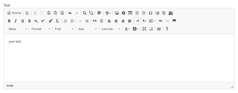
Many blocks contain feature-rich text editor pictured below:

Hovering over a button in the editor gives a description of its function. The editor functionality is common to many word processors and is not described in detail in this document.
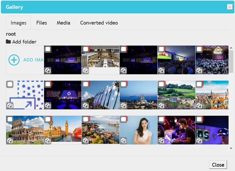
Many blocks also allow the user to insert images, videos, and other files. All such files are handled through a file gallery, which is global across events:

The gallery has several tabs at the top:
Images - contains all images that have been uploaded and/or cropped for use on the website.
Files - contains all files that do not fall into Media and Images sections (.pdf, .doc, etc.)
Media - contains all video and sound files (not images).
Converted video - contains videos that have already been converted for web use.
Each tab also has an Add Item (e.g. Add Image, Add File, etc.) button in the top left. The user should first check the gallery to see whether content they wish to use is already present, and use the Add Item function when a not yet existing item should be added to the gallery.
This short video provides an overview:
