Feature Purpose:
This feature allows users to set up and customise the colour scheme of their application. This is useful for multi-event applications, where each event might require a distinct visual identity. Users can adjust the main app colours, including the login screen buttons, to align with their brand or event theme.
Working with this Feature:
The initial step would be to locate this setting within the App builder. Kindly follow the below steps:-
-
Within the admin panel select the option Apps
-
Within the app, choose the specific app, where color setting needs to be applied
-
After selecting the app, navigate to the “Settings”
Event Selector:
For multi-event apps, an event selector is a crucial tool. It enables users to choose the specific event for which they want to customize the color scheme. This selector ensures that each event maintains its unique identity within a single app framework.
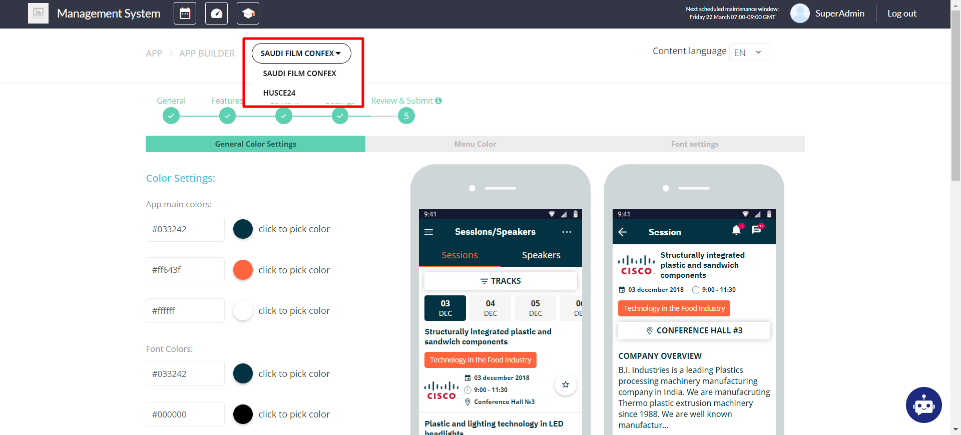
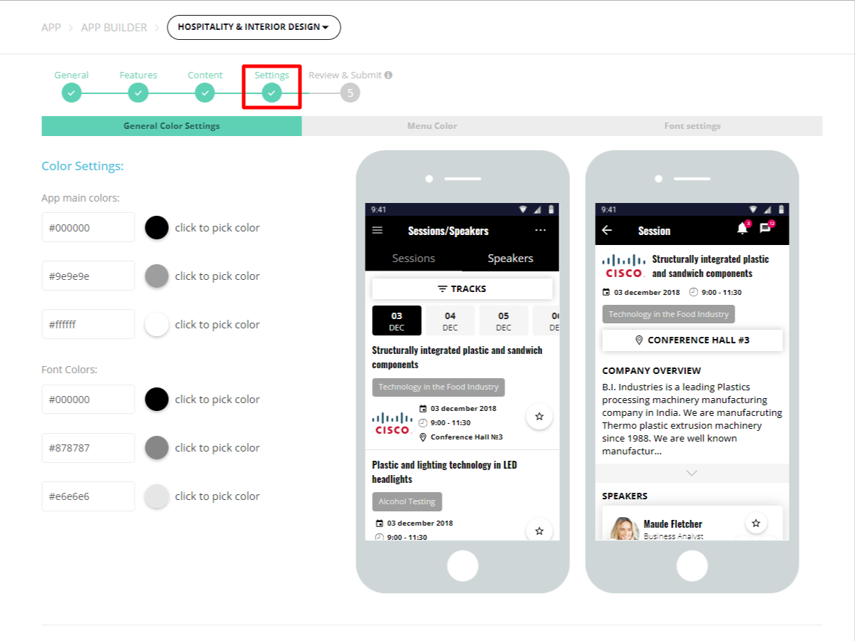
General Colour Setting:
Users have access to six color options, out of which five are to be actively used:
Brand Color 1: This is the primary app color, appearing in the header of each page and on all main elements. It sets the tone for the app's overall aesthetic.
Brand Color 2: Serving as the secondary app color, it's used on minor elements like active tabs to complement the primary color.
On-Brand 1 Color: Primarily for text, this color ensures legibility against the Brand Color 1 backgrounds.
Text Primary Color: The default color for all main text, titles, and content that appears on the app's white background.
Text Secondary Color: Used for less prominent text, such as additional information, to ensure hierarchical visual clarity.
The sixth color, currently designated as white, is slated for removal in future updates and should not be used.
Login Screen Buttons Colors:
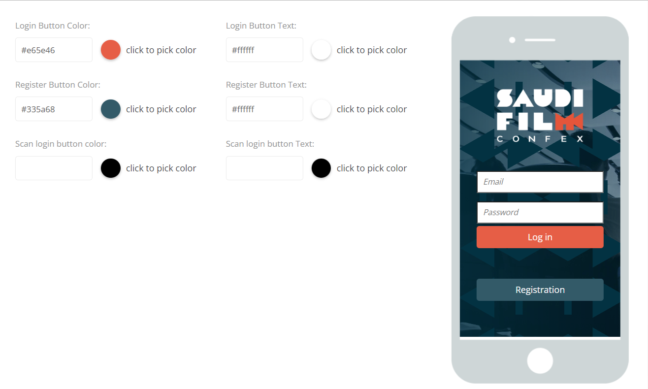
Customisation extends to the login screen, with three buttons available for color adjustments:
-
Login
-
Registration
-
Login via Scan (exclusive to OTP login screens and not shown in previews)
For each button, users can set both the button color and the text color to ensure accessibility and brand consistency.
Real-time Updates:
A major benefit of this feature is the capability to modify the app's color scheme directly online, eliminating the necessity for updating the app itself. This means any changes to the color settings are reflected instantly in the live app, facilitating seamless updates to the branding and theme in real time.
Troubleshooting:
Preview Limitations: Current previews are based on older designs and offer only a schematic representation of the final appearance. Users are advised to review changes directly in the app for accuracy.
Color Contrast: When customizing text and background colors, ensure sufficient contrast for readability. Poor contrast can lead to usability issues.
Unused Color Slot: The sixth color option, intended to be white, is marked for removal. Avoid using this slot to prevent future compatibility issues.
Note for Future Updates:
This page, along with the preview functionality, is scheduled for a redesign to better reflect the app's current design language and to provide a more accurate visualization of color scheme adjustments.