Feature Purpose:
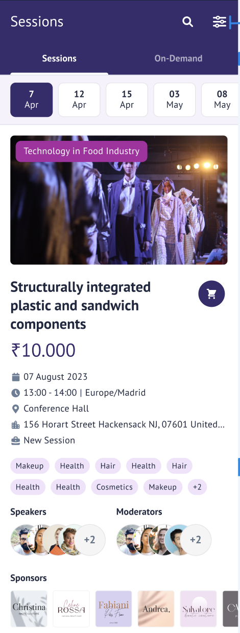
This page lists all the sessions and their details.
Working with the feature:
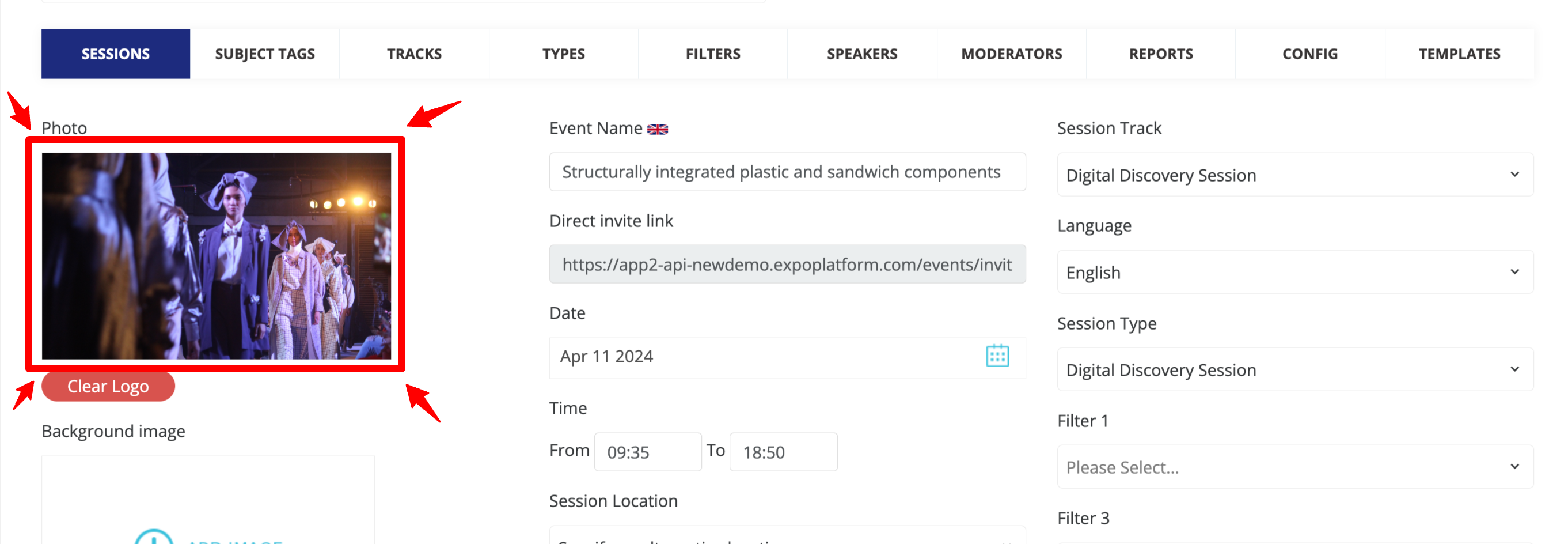
Session image:
The session image can be configured from the Admin Panel → Management → Sessions
Sessions Countdown:
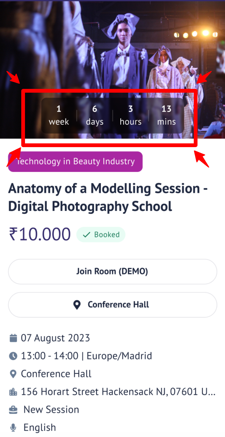
The timer displays the time left until the event goes live from now in the fixed format Weeks, days, hours and minutes.
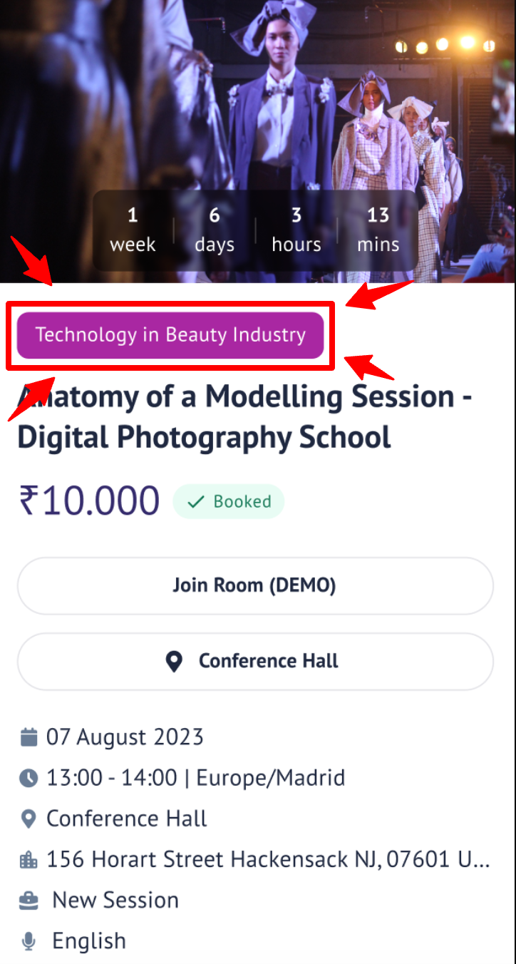
Session Track:
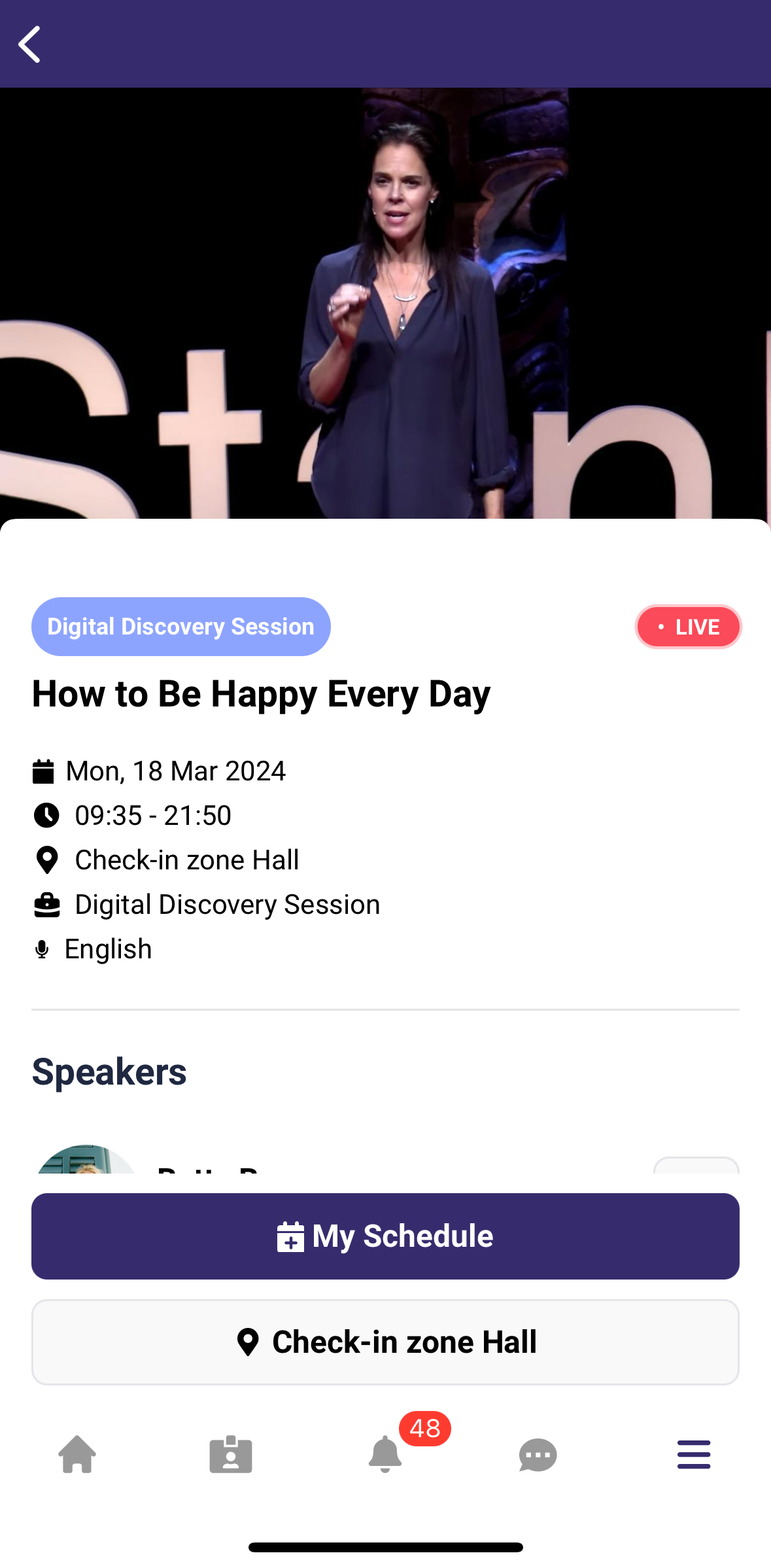
The session track tag is visible on the session card below the session image, showing the general theme/topic of the session.
When the session is live a 'Live' tag is visible on the session card showing that the session is taking place.
Session Info:
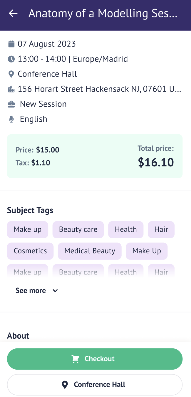
Session Date - Shows the date when the session will take place. Session Time - Shows the time of the day when the session will take place. Session Location - Shows the location where the session is taking place. The session location can either be "Online" in case of an online session, or it can be taking place at some particular Hall and Stand, or else it can be an custom location that is set by the organiser. Session Type - Shows the type of the session that is taking place. Session Price - Shows the session price along with tax (if applicable) for the paid sessions.
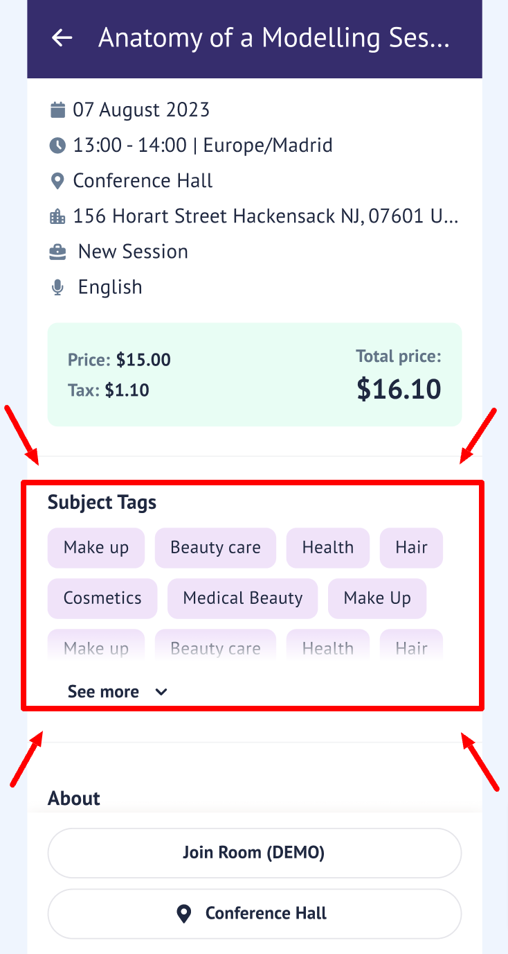
Tags:
Subject tags in the session info shows all the tags related to that session.
About (session description):
A session description tells you all about what a session is going to be like. It gives you details like what the session is about, what you'll learn, who it's for, how long it lasts, and how it's going to be taught. It helps you decide if you want to join the session or not. And for the organiser running the session, it helps them plan and make sure they cover everything they need to.
Sponsor block:
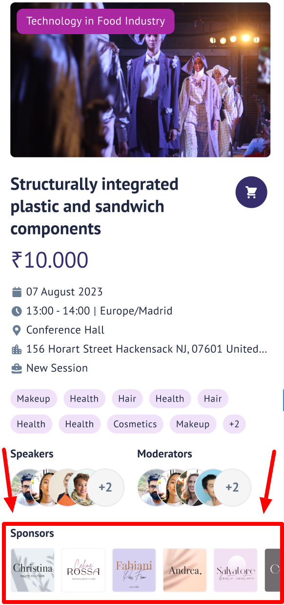
Sponsors on the session card. Sponsors appear on the session cards without any interaction button as they don't have any profiles on the event platform. However, clicking on them will take the user to the sponsor's website set up by the organiser.
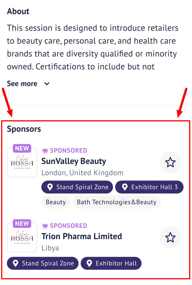
Tapping on the exhibitor card in the session will open the exhibitor's profile. If the user is logged in they can interact (favourite, message and send meeting request) to the exhibitor right from the exhibitor's card.
Speakers/Moderators:
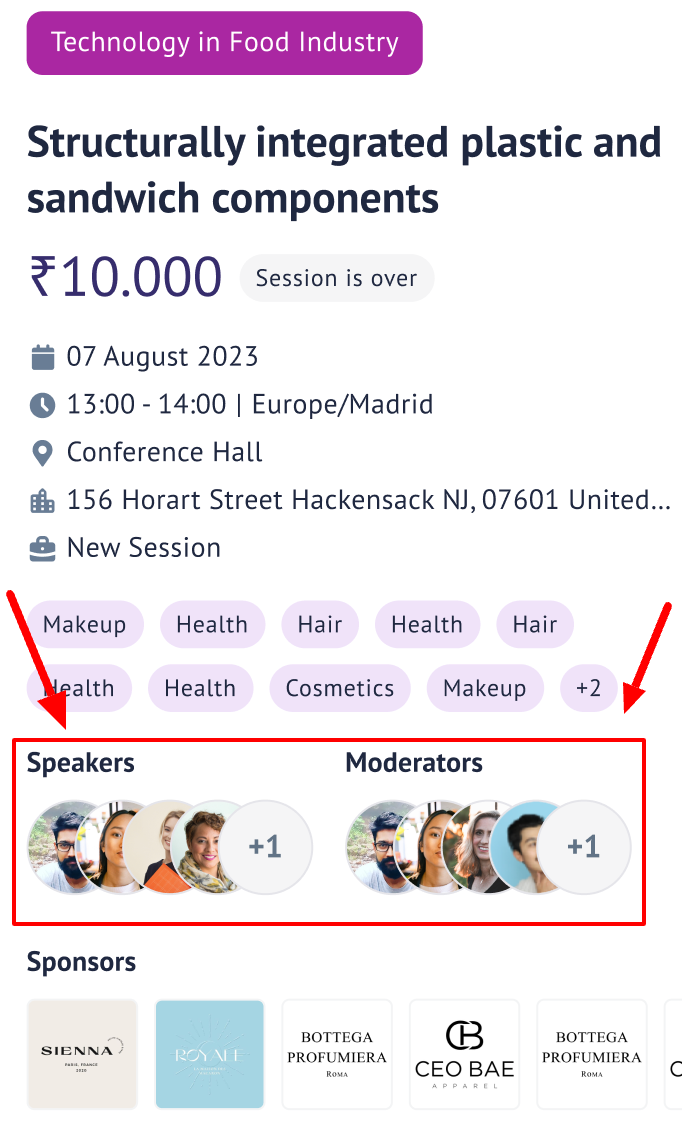
Based on the permission matrix and the network opt-in the users can see the Speakers and Moderators on the session cards.
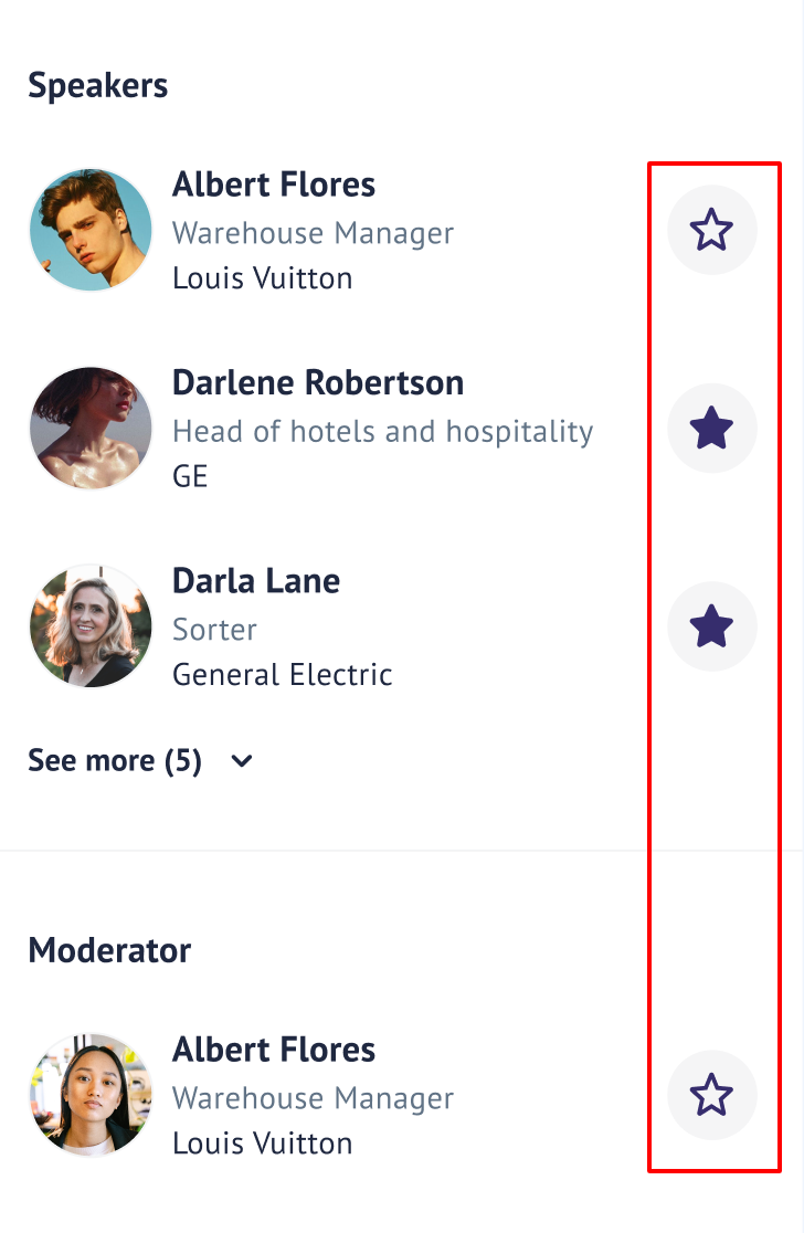
When the user clicks the session to open the detailed view, based on the networking opt-in settings of the current user the user will be able to see the interactions button (favourite, message and send meeting button); the interaction button will not be visible for the unlogged users.
Tapping on the speaker/moderator card will open their respective profiles for the user.
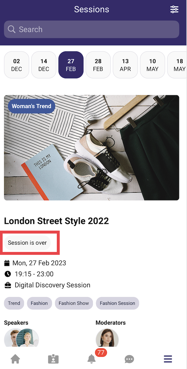
Session is over
When the session is over the tag 'Session is over' is displayed on the session card
Online session
If the session is online, a 'Join Room' button will appear on the Session card using which users can join the session.

Session location
If applicable session location also appears on the session card, for example: Conference Hall in the above image.
The "Rotating Location Text on Button" feature ensures that attendees can always view the full location details (venue → building → room) for sessions and events, even when the text is too long to fit on smaller screens. When the location text exceeds the button width, it will automatically scroll in a smooth, seamless loop, making the entire string readable without disrupting the button's main action.
This feature is automatically applied on:
-
Individual Session Details Page
-
Exhibitor Events Details Page
-
Round Tables Detail Page
-
Speed Networking Detail Page
Please note: This feature has not yet been added to the Meetings Detail Page or Concierge Meetings Detail Page
Rotating text details:
-
If the location text fits within the button, it remains static—no animation or fade effects are shown.
-
If the text is too long, the component detects the overflow and triggers a horizontal scrolling animation.
-
The location pin icon and text move together as a single unit, ensuring the icon is never separated from the text.
-
The scrolling animation loops infinitely and seamlessly, so there are no visible jumps or gaps.
-
Subtle fade gradients appear at the left and right edges during active scrolling, indicating more content is available. The fade gradients only appear during active scrolling and match the app's background color (#f9f9f9) for a seamless look.
-
The component is fully responsive: if the device orientation or screen size changes, it recalculates and restarts the animation as needed.
-
For performance, if scrolling isn't needed, the component remains static with no extra effects.
-
The animation uses content duplication (with a 16px margin) to create a seamless loop; this is visually imperceptible to users.
-
The feature is robust to screen size changes (e.g., device rotation), recalculating overflow and restarting the animation as needed.